|
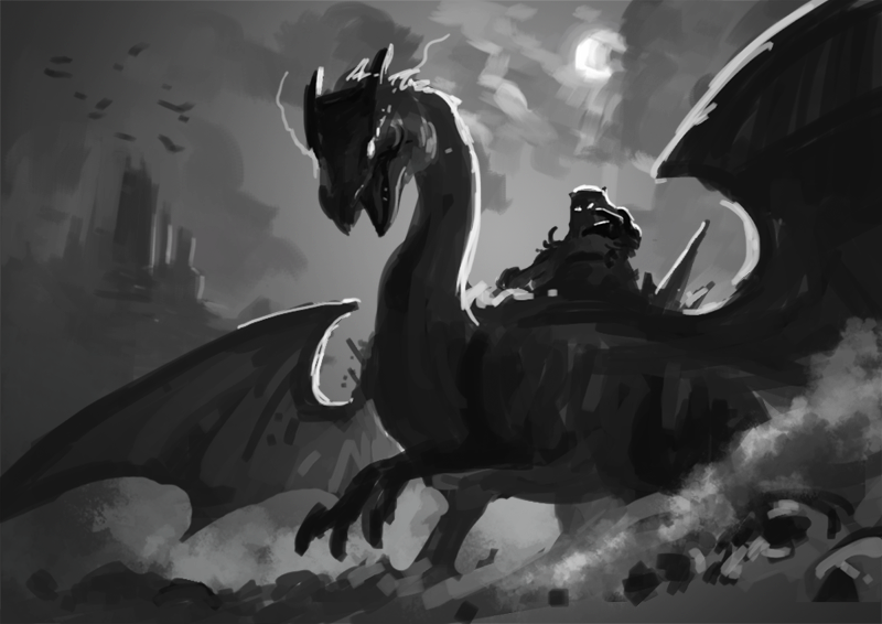
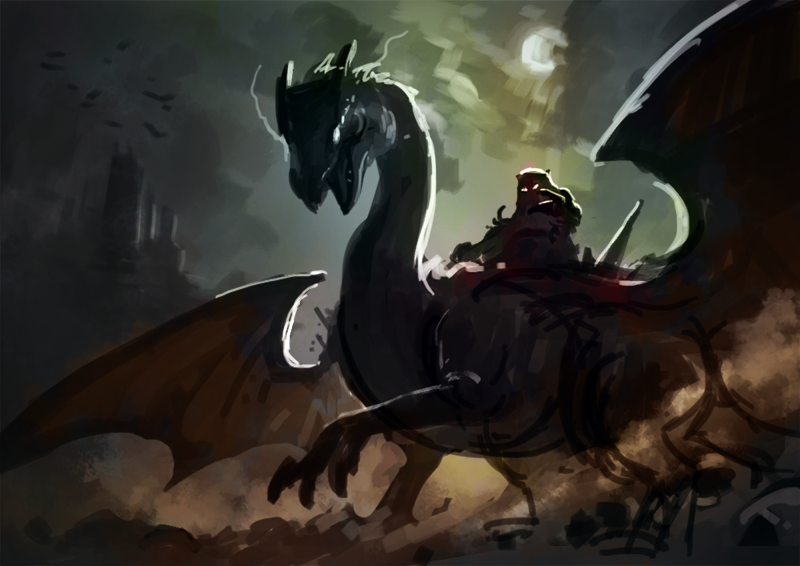
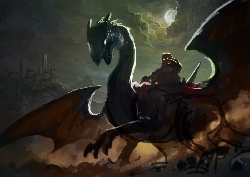
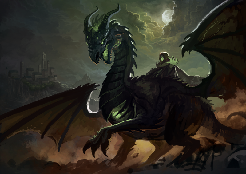
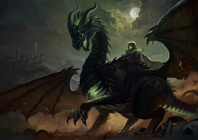
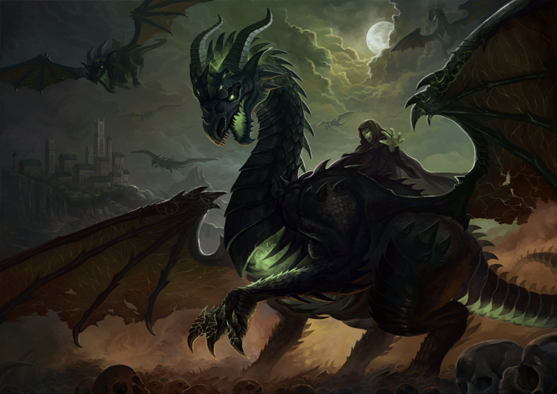
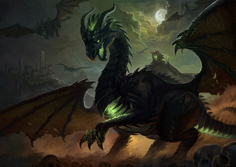
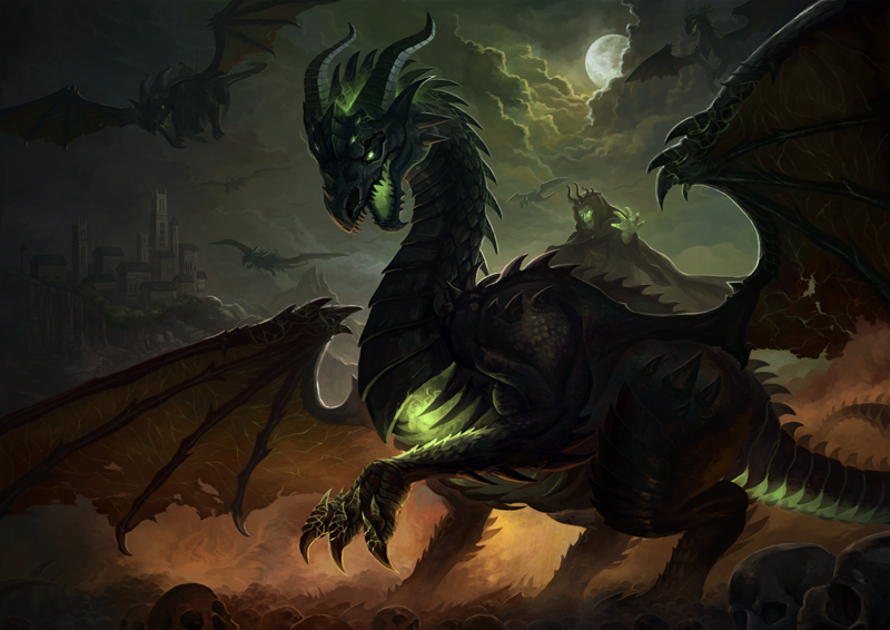
The disciples stood nervously as they awaited their judgement. With a thunderous roar, the headmaster descended upon the cliff of skulls, riding his new pet the Black Dragon. They gasp as the Black Dragon extended its wings, an intense green glow bursting our from its chest. The headmaster raised his hands and all at once, everything seemed silent. He bellowed, "Look at the person to your left and right. They will not graduate." Based on a true story. So a few months ago my Alma mater Digipen introduced the dragon as their new mascot. They featured an old dragon artwork I did when I was in school in their Facebook page. It made me realized that it has been a while since I drew dragons, so I whipped out my pen and started sketching new ideas for a new dragon illustration. The above paragraph is an over-dramatized version of true events that happened in school when the school's president flew down from Redmond to the Singapore campus to reprimand us of our bad behaviour. I remember I was still a freshman and it was only my first week of school. It left a big impression on me and my friends and we will always bring it up from time to time during our school days. I wanted to tie in the dragon illustration with the idea of the scary leader of the school descending into the scene. As usual, I started with a quick black and white tonal sketch in Photoshop (after doing a super rough drawing on paper). This step helps me organise the different elements I want in the image. I initially wanted to have some bats flying behind the castle in the background. I then block in some colours using the Overlay, Colour and Multiply blending modes. A friend recently asked me how I decide on what colours to use. My answer is simple: I colour pick from images I like. They range from photographs to other paintings done by other artists. I understand the morality debates on this issue, but all I have to say is that the colours I picked get edited out eventually. To the point where they may not even resemble the reference image. I will often run a Hue/Saturation and Colour Balance filters on top of it to find the colour scheme that I like. This process gives me a good head-start to the illustration and I have been using it since my school days. Next, I go on and detail the background The dragon is a relatively complex character in the scene, so I start by doing a more detailed sketch before proceeding with the final details. Besides Digipen's mascot logo design, I also drew inspiration from other famous dragons like WoW's Death Wing. I decided to be less lazy and do a few more dragons in the background instead of bats. Sometimes we have to force ourselves to put more hours into a painting to make it that much more epic. I submitted a preliminary image to the LevelUp! group and some of the members told me that the headmaster's design was too simple compared to that of the dragon. While I do not want to deck out the headmaster with too much details, I do agree that he needs some additional gear. I added a simple crown and hinted at some sort of armour beneath his cloak. At this point, the entire piece feels like it lacks that last bit of oomph. I decided to fall back on an old technique I used in school, where I overlayed a piece of texture on top of the entire painting. The difference is subtle here, but it adds more colour to the painting, especially the skin of the dragon.
I'm quite satisfied with the final result and I hope you enjoy this illustration too!
2 Comments
Leave a Reply. |
Archives
April 2023
Categories
All
|


 RSS Feed