|
Modeling a small village/town has always been a project that I wanted to pursue ever since learning more about environmental modeling from my full time job. I recently found some time to attempt it and I began gathering ideas. I knew I wanted to skip the concepting phase so I decided that I will model something based off another video game. Initially, I was contemplating on doing the entire first level of Metal Slug X. After spending one whole day just sculpting rocks in Zbrush, I knew I would not have the patience to complete the whole level. I decided to give myself a one week duration, and turned towards the sandy beaches of Costa Del Sol, from Final Fantasy VII. 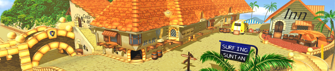 Original FFVII Costa Del Sol pre-rendered background The original environment looked a little dated, so I decided to do a quick paint over to re-establish the colors and to clarify some of the ambiguity in design. While doing the paint over, I quickly realize that the buildings were in fact not scaled properly. The van in the background is as tall as the opening of the door. It made sense back in the FFVII world as characters were represented by a 'chibi' version due to technical limitations of the Playstation. I decided to stay true to the roots and not edit the building proportions. 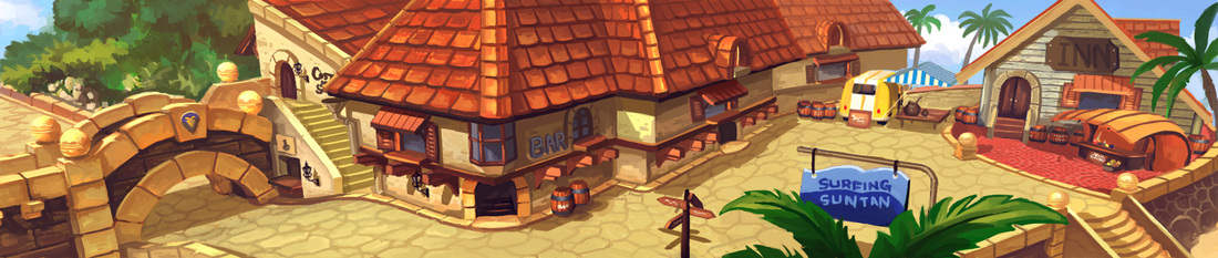 Paint over of original background sheet The gray box models were massed out to give a clearer picture of the proportions in the 3D space. I was debating between whether to include ZBrush in the workflow, as it wasn't particularly necessary. I decided to put off the decision to a later date and concentrated on the textures first. 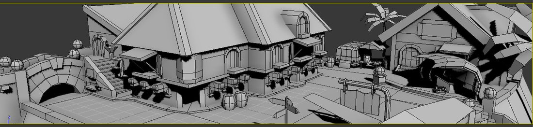 Unlike the Class 30 model, the workflow for this project began with the texturing phase first. I allocated what I felt was sufficient space for each element in the concept based on the screen real estate they occupy. I underestimated the time required for texturing, and the whole project was extended by two days. Eventually, I settled on not using ZBrush, as that would further extend the production period. The normal maps were generated using nDo. 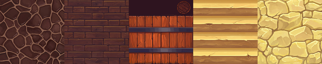 Texture details 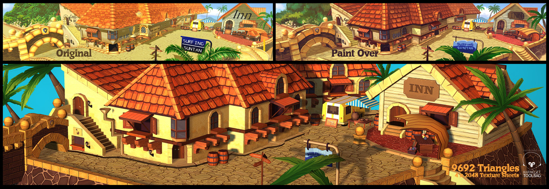 Final  I tried doing the final render using XoliulShader, but the transparency from the opacity resulted in a lot of noise. I went back to Marmoset toolbag to finish things up.
Overall I'm quite happy with how it turned out and definitely learned a thing or two from this project.
1 Comment
New art for the new year! Steps below:
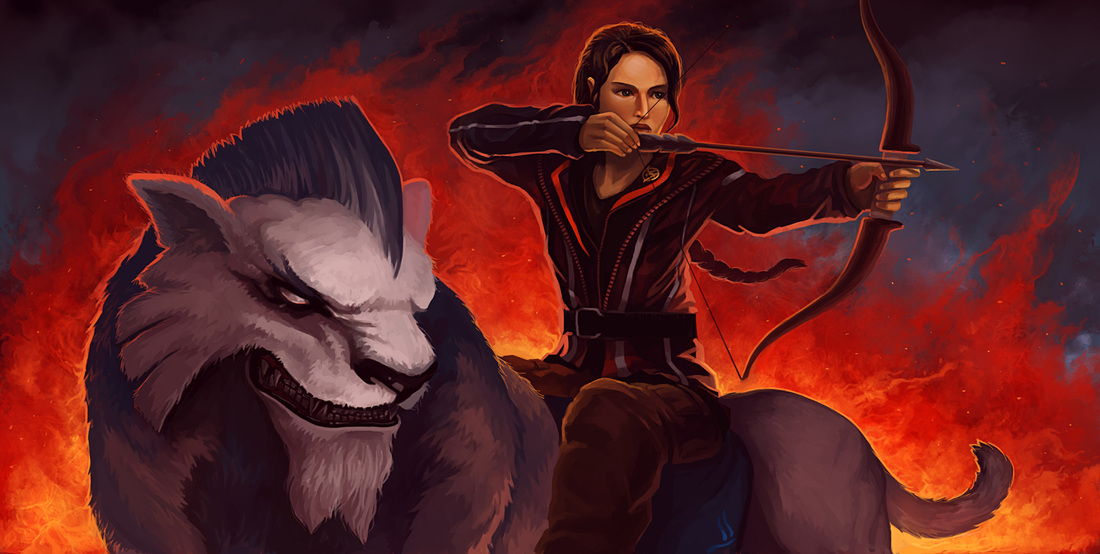
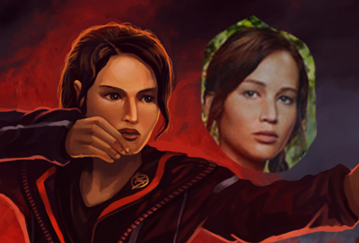
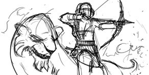
I had the idea of doing a Hunger Games and Dota 2 crossover artwork after I read Catching Fire, the second book in the trilogy. Although I am not a huge fan of the movie adaptation, I felt that Jennifer Lawrence was the right fit for Katniss, so I decided to portray her likeness in the painting. I started scribbing thumbnails on paper. Initially, I preferred the left layout, as it felt more dynamic (the mount was supposed to be leaping through the air) but I felt that left a ton of empty spaces around the painting. I wanted to do a desktop wallpaper-friendly resolution and already planned to have a simple fire background, so I went with the right layout eventually. 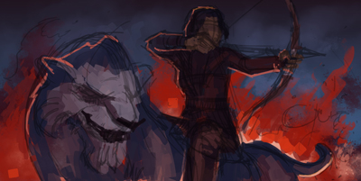
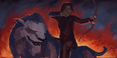
Starting with a gradient, I quickly blocked in the basic colors of the painting. I decided to extend the fire to frame Katniss and her mount. 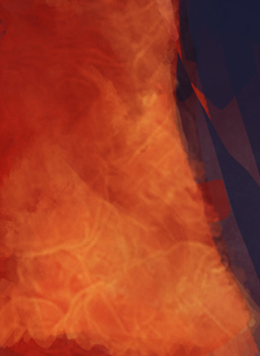
I didn't want to spend too much time on the fire, so I simply took a fire texture and overlayed above the base colors. 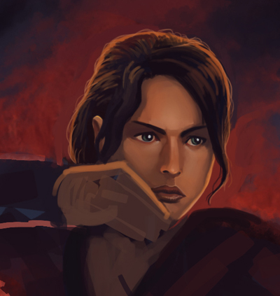
One of the initial goals of this painting was to capture the likeness of Jennifer Lawrence. I realized quickly that I'm not hitting the mark at all. I continued to spend hours, trying several techniques, even resorting to superimposing a photo of her on top of the painting for guidance. After numerous failed attempts, I begin to worry that I will abandon this painting altogether because of it. 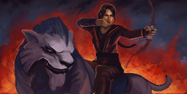
I decided to take a step back and work on the other aspects of the painting. This gave me some confidence, but I knew I had to tackle the face again later. 
I normally leave the color adjustments and curves editing to the final step, but I was feeling so bad about the painting that I needed more morale boost at this stage of the painting. 
After detailing the mount, I proceeded back with work on her face. 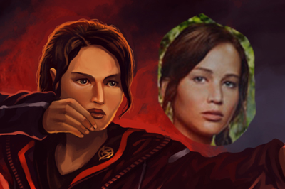
Edits after edits and I still could not achieve any form of likeness. At times, I felt I even made it worse. I became quite frustration and the painting was going nowhere. I decided to stop working at it at a certain point and left the face alone. 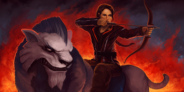
Added the bow and cleaned up the fires behind. The image is completed. 
Here's the final image again. I originally intended to have a decorative text at the bottom of the image (thereby extending the image to a wallpaper-friendly 1920x1080 resolution) but I was tired of the image after failing repeatedly on the face. I decided to crop it off and call it a day.
Definitely not the best of starts for the new year, but I will work on improving my human facial painting skills! |
Archives
April 2023
Categories
All
|

 RSS Feed
© 2012 - 2023 JASON WANG