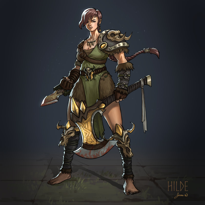
 This started as an Ipad sketch which evolved into an in-class demo on how to color character designs. The following is a step-by-step breakdown of the process: 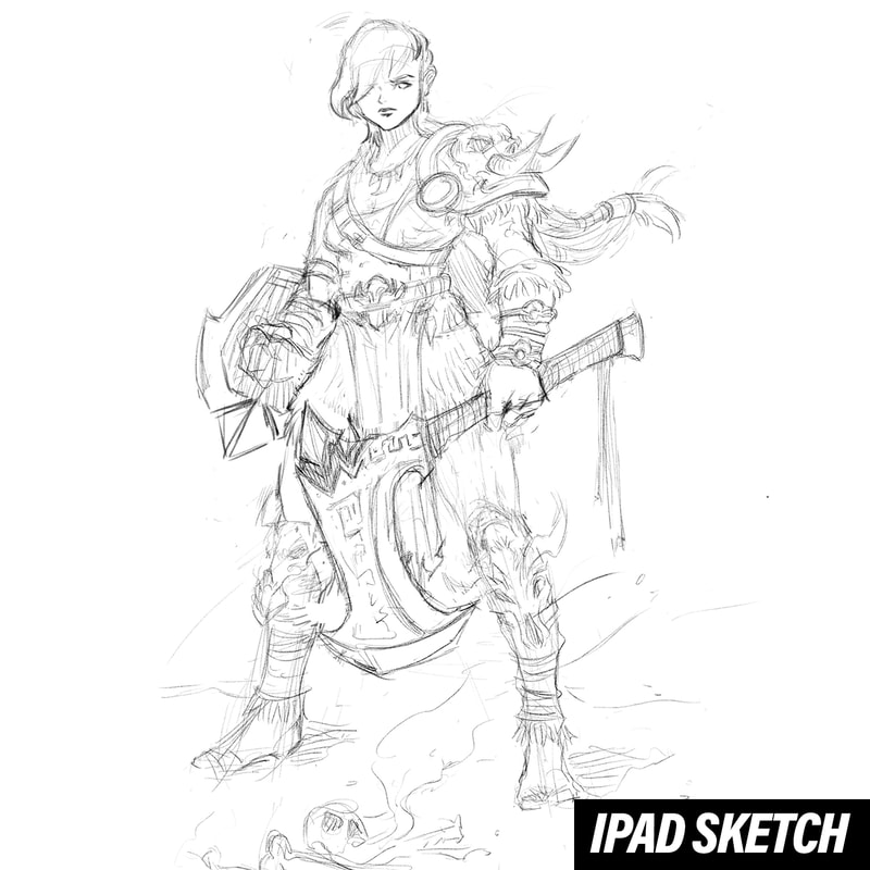 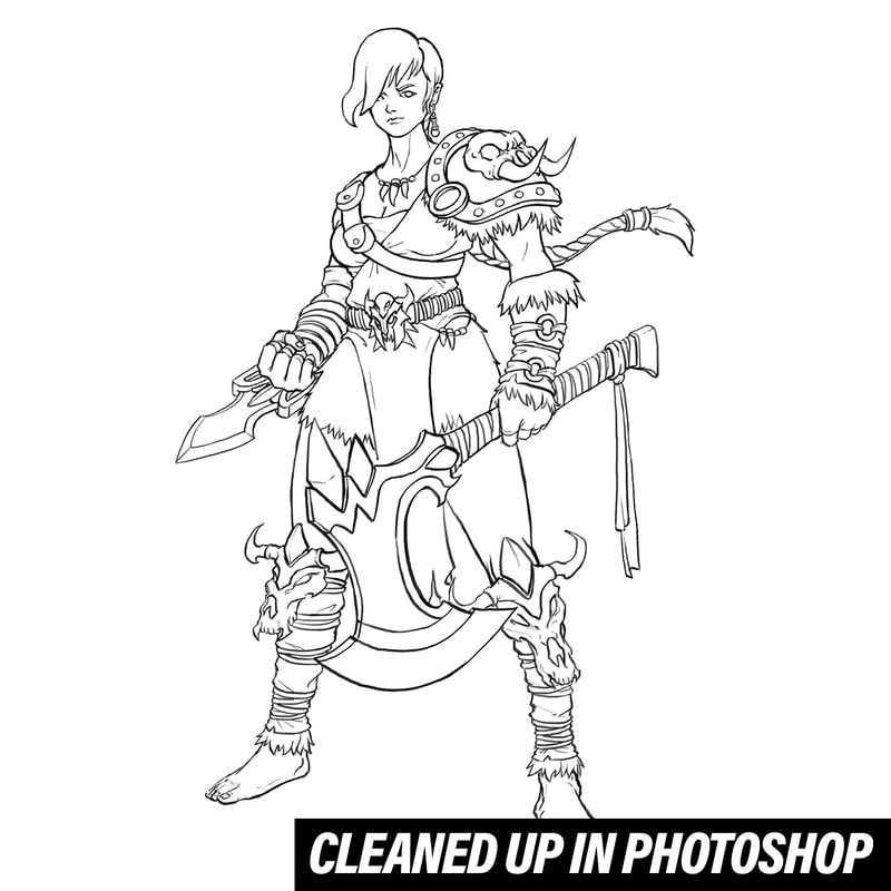 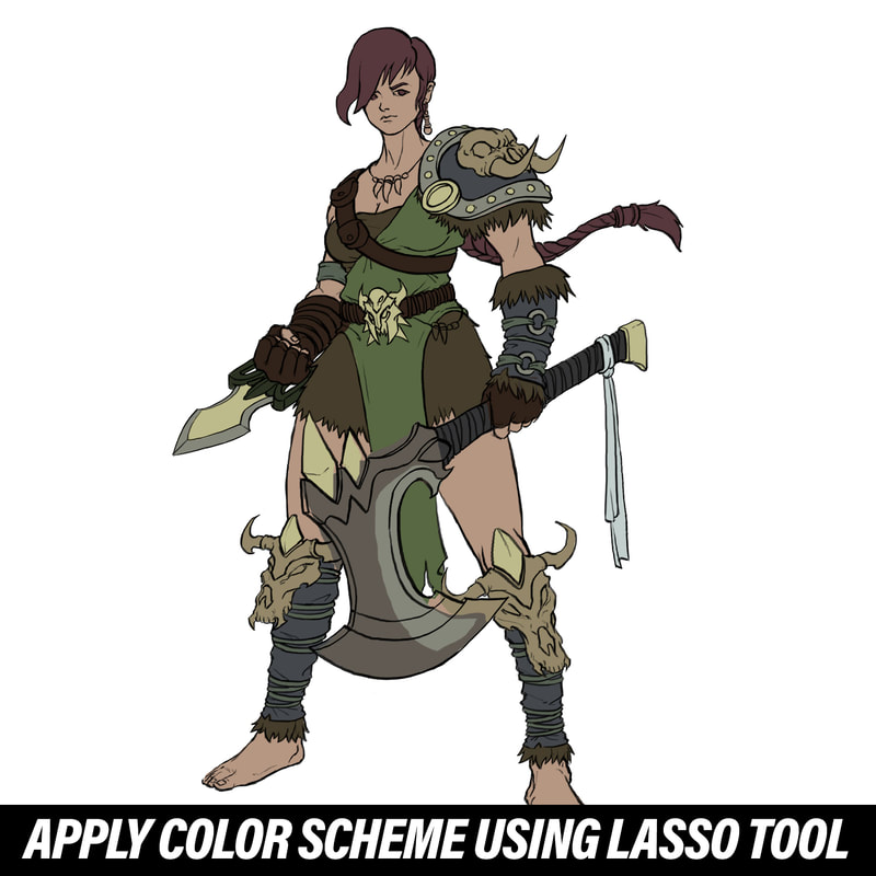 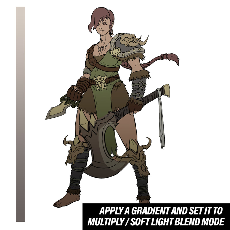 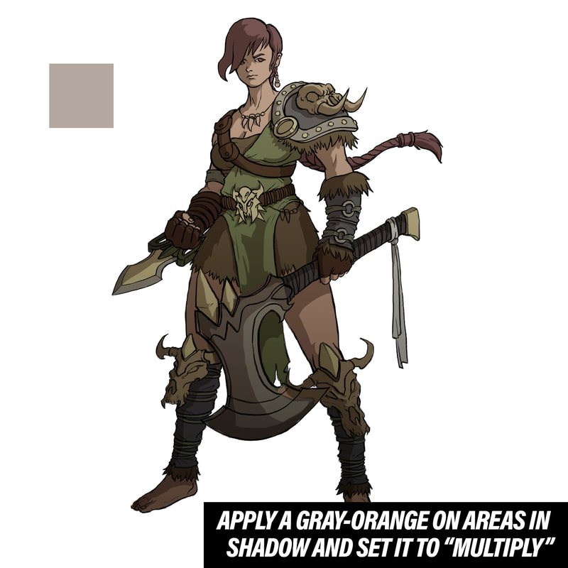 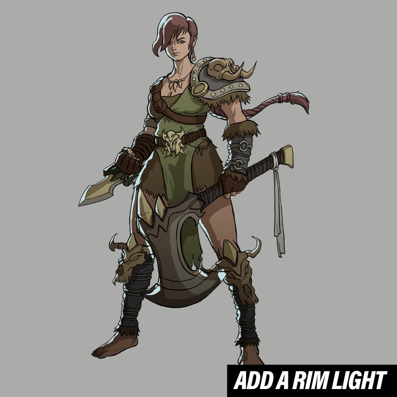 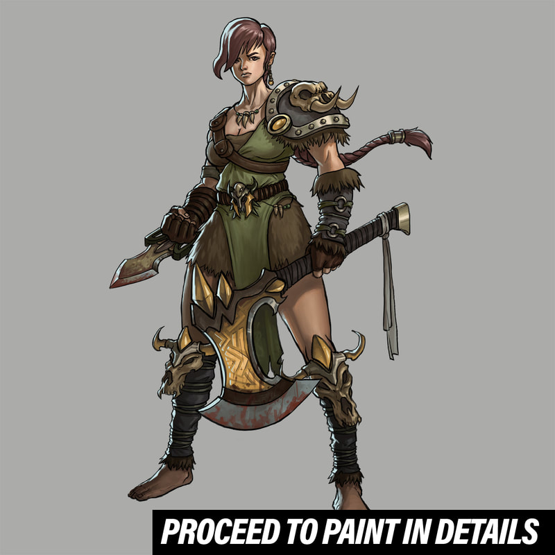
0 Comments
This post is long overdued. I first posted this series of artwork created to coincide with the Lunar New Year (which took place early February this year) on my Instagram page but I didn't find the time to do a proper post here on the blog. So here it is, in its full glory: 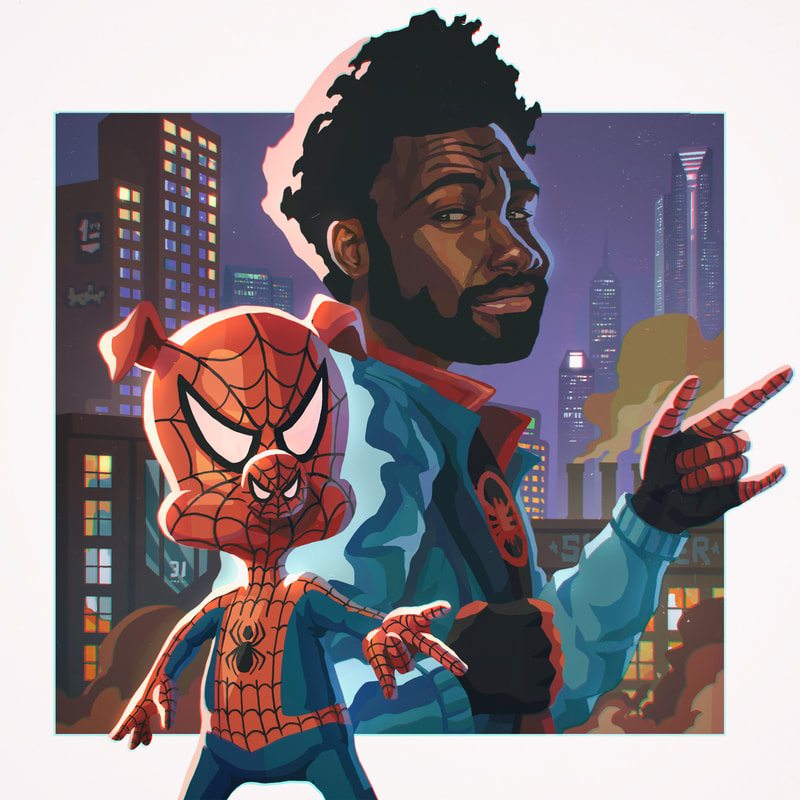 Like many artists, I was super inspired after watching Spiderverse late last year. I really love the art direction of the movie and the way each shot is composed and set. While not a huge fan of chromatic aberration in general (the effect was used awfully in Netflix's Sabrina in my opinion), I appreciated the application in Spiderverse. The effect seemed appropriate for the frame-by-frame visual eye-candy overdose that the filmmakers were going for. In creating the above fanart, I set to emulate the film's art style. Coincidentally, it aligned with the style I am currently exploring in my art as well (using blocks of solid hues with little to no blending). In preparation for the above piece, I also did simple sketches and paintings. I have never painted black people before and I took this opportunity to learn more about achieving that particular skin tone. 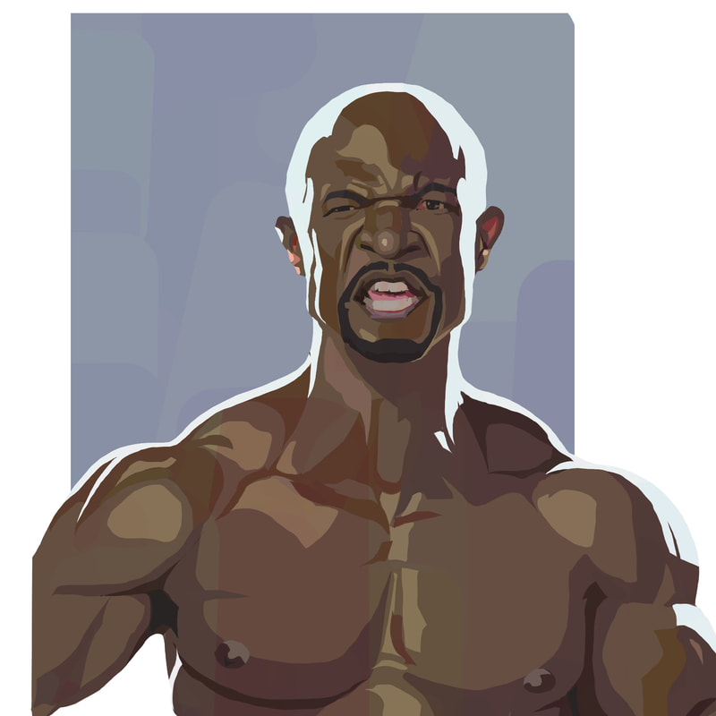 Terry Crews 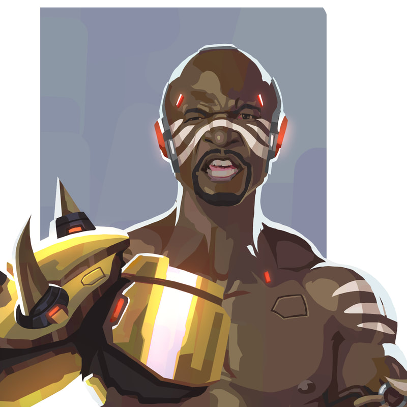 Terry Crews as Doomfist 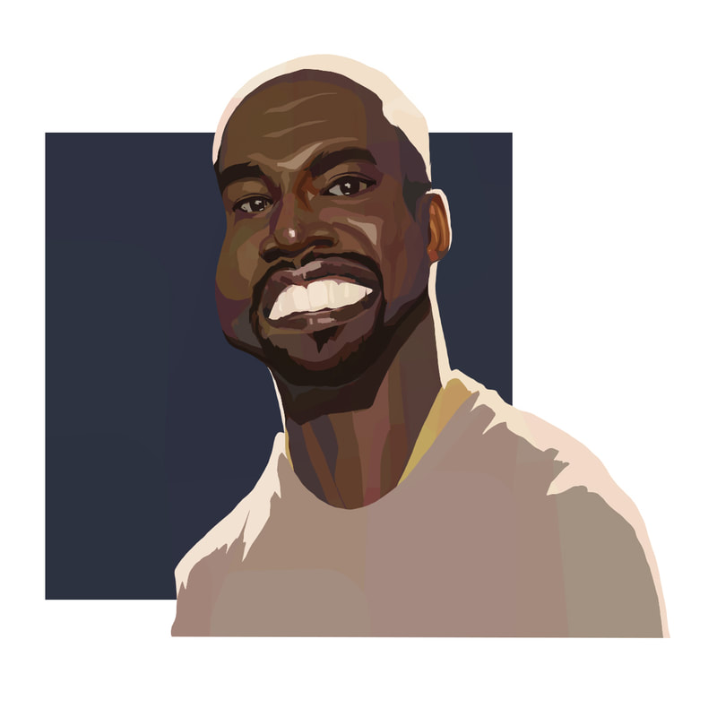 Kanye West 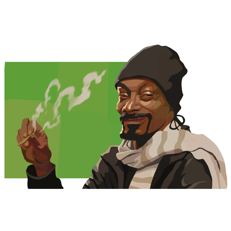 Snoop Dogg 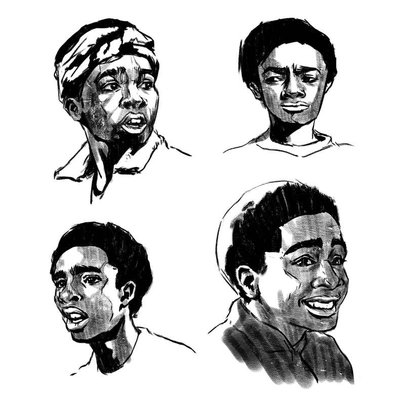 Sketches of Lucas from Stranger Things 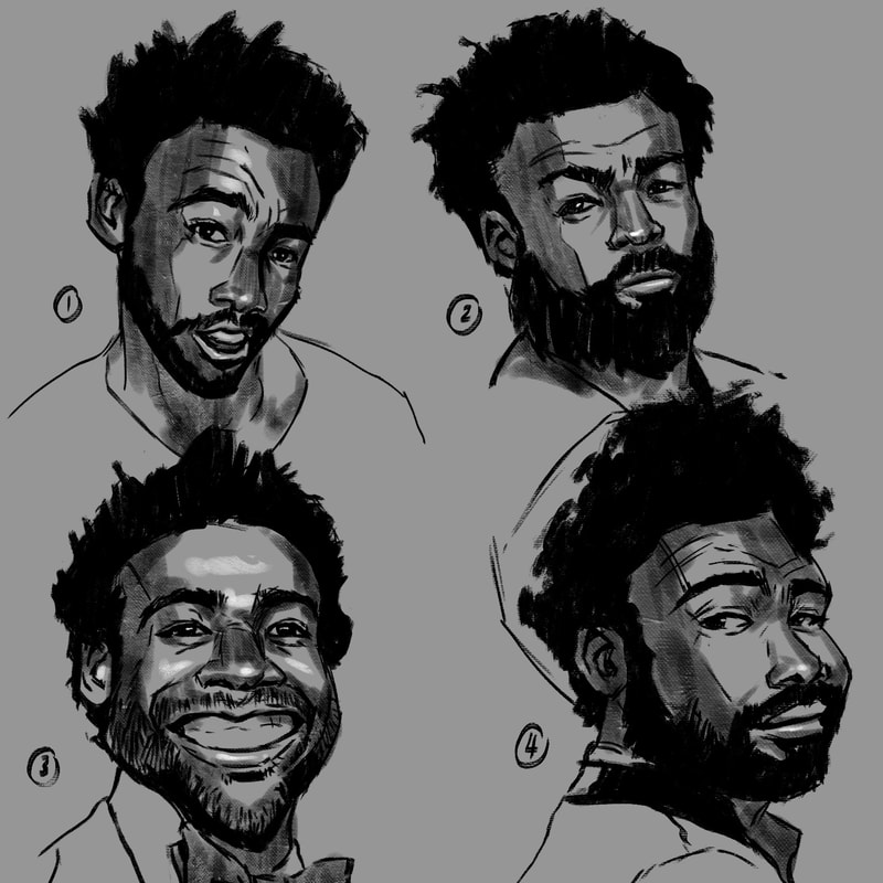 Sketches of Donald Glover |
Archives
April 2023
Categories
All
|

 RSS Feed
© 2012 - 2023 JASON WANG