|
Wasn't inspired to draw anything in particular after the "Father and Son" piece until I saw that deviantART was running a "The Good Dinosaur" fanart contest. Decided to give it a shot since I like dinosaurs and Disney films. I started my Schoolism subscription by taking Dice Tsutsumi and Robert Kondo's "Painting with Light and Color" recently (I'll post my assignments on this blog sometime next week). I exercised some of the techniques taught in the first lessons for this piece. I did a quick block out of the silhouettes of the characters in the scene. For this piece, I placed the main characters near the center of the page and surrounded them with the antagonists. I tried swinging the tail of the raptor in the foreground back into the center of the composition to drive the viewer back to the image. Next, I created a white screen layer and drew on top of the rough sketch. This allowed me to more accurately draft out the volumes of the characters. Personally I prefer to execute this step with lines. I cleaned up the blocking shapes and applied some colors using the Overlay, Color and Multiply layers blend modes. With the base colors in, I quickly did a second pass of the sketch, adding the diffuse surface colors to each character. Detailing the background. For this piece I spent less time on the details. I'm trying to incorporate the use of more texture brushes in my workflow. While detailing the foreground raptor, I realized that my poor command of dinosaur anatomy will probably result in an inaccurate depiction of the backside of the raptor. I decided to go with a simpler pose in the end. I think it still serves a similar function of guiding the viewer's eye into the painting. I drew in a tree where the tail used to be in the midground. The idea here is to break up the arrangement of the trees and add the illusion of depth. The raptor on the right looked like he was standing at the same distance away from the viewer as the heroes are. I pushed him back slightly with a light fog and pulled the heroes forward by enhancing the contrast levels with Curves. After some color adjustments and god ray effects, I was ready to call the painting done. I was still unsatisfied with the illusion of depth between the characters. I think one mistake I made was making the right raptor too big, especially in relation to the raptor in the foreground. I did a cheat and simply blurred out the background and the 2 raptors to fake the depth.
0 Comments
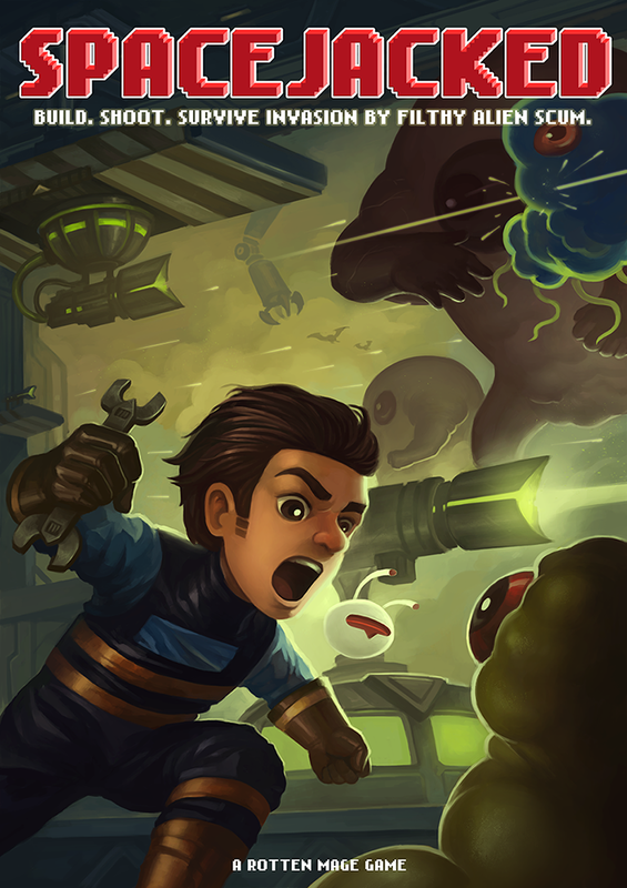
I was commissioned by my friends at Rotten Mage to create their poster for Game Start 2015. If you're attending the event this weekend, be sure to check them out! They are located in the "Singapore Gamebox" section of the convention.
Their game is coming out on Q1 2016. Be sure to give them your support! http://www.spacejacked.com/ |
Archives
April 2023
Categories
All
|


 RSS Feed