|
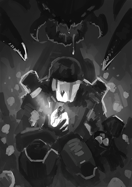
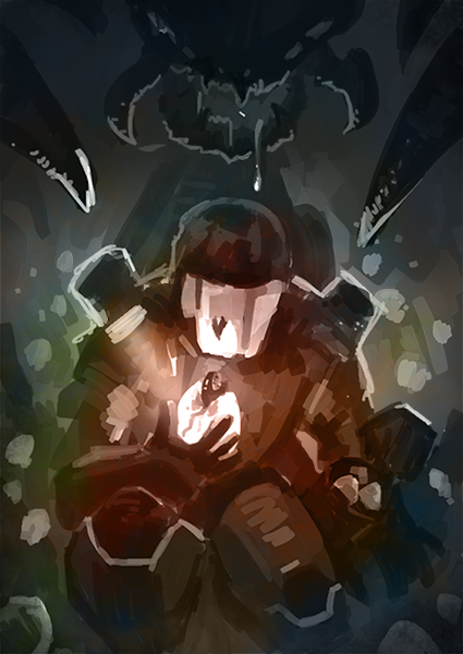
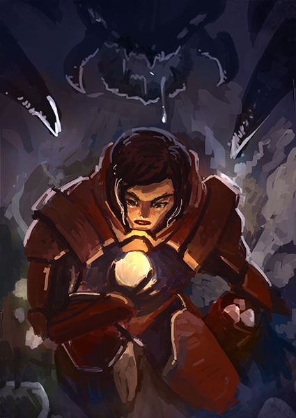
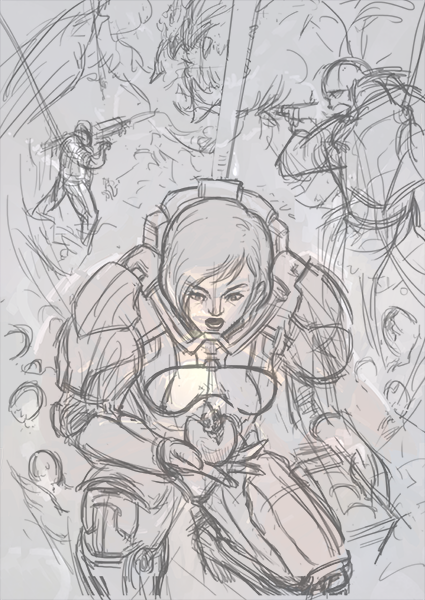
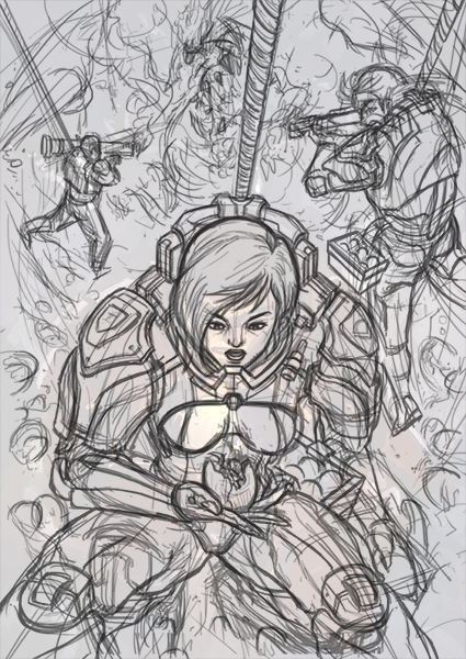
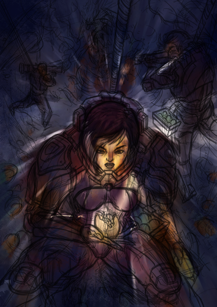
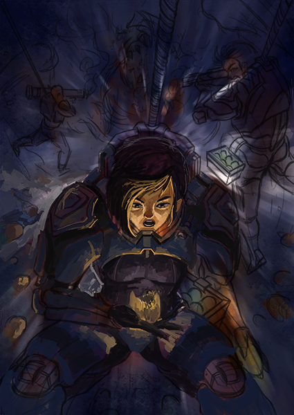
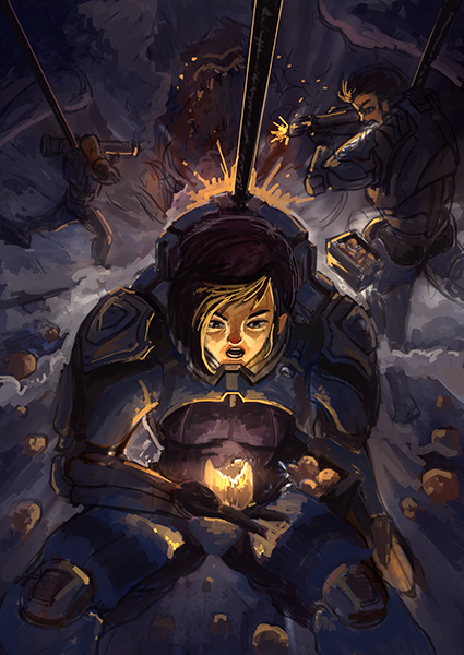
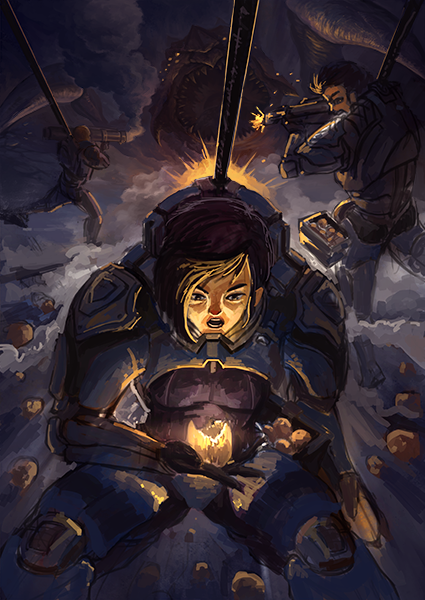
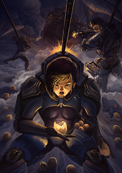
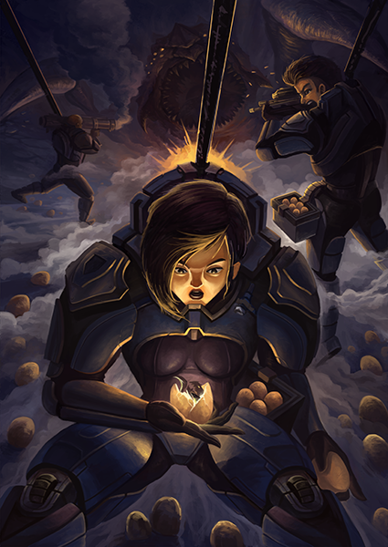
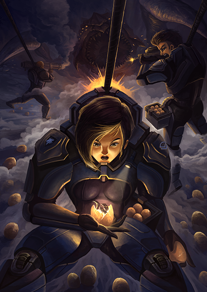
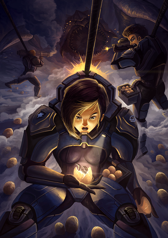
It's been about 2 weeks since I posted anything. Crunch at work has kept me preoccupied and away from personal work. Uninspired to create anything new, I looked through the folder of thumbnails I made when I was preparing artwork for the Bali workshop and selected one that interest me. I went with this one as it has been awhile since I made something of a more realistic style. The sci-fi genre is also something I rarely approach, so I thought it will be a good learning exercise. The first thing I noticed while looking at the thumbnail again after 6 months is how awfully boring and cliche the image was. I also didn't like the suit design of the main character, which was a blatant Master Chief rip-off, sketched quickly at that time to bring the idea of a space marine across. However, I decided that I can fix the suit later and proceeded to block in the colors first. I removed the helmet on the marine. I also made the decision to cast a female for the role of the main character. At this point of the painting, I felt that things just ain't working. The new suit looked identical to Baymax from Big Hero 6, the female character's face didn't look appealing. The color scheme was also wonky; it didn't feel like a sci-fi painting. I was feeling quite depressed about the direction this painting was heading and almost stopped working on it entirely. But I decided to reset and give it another shot. I've recently started watching Attack on Titan (yes, I am very up to date with the latest anime) and have become hooked onto the series. For the re-envisioned illustration, I decided to tweak the story. It is still about a marine finding an alien baby and unaware of the alien mother creeping behind. The new story introduced her other squad members, who are clearly aware of the sneak attack and fending the angry mother off the main character. I added in the repel line on the squad members to add to the drama as they are stuck in this hole with the angry alien quickly approaching towards them. I did another pass of the line work, adding more detail to it. I didn't want to waste the effort from before. While I didn't like my initial color choices, I felt that the values were not too bad. So I applied Hue/Saturation and Color Balance adjustment layers and a motion blur filter to the original layers to fit them into this new composition. I know the success of this piece hinges on the rendering of the main character, so I started with her first. Also notice that this for this painting, I collapsed the line art into the color layers. I don't usually do this, but I thought I managed to capture the emotions quite nicely with the line art this time around, and didn't want it to go to waste. I blocked in the basic colors for the background and finally the foundations of the painting was set. From here on, I felt less stressed about the final outcome of the painting. I can just relax and mindlessly render the details. I started with the alien in the background. Then the main character. And then the character on the right. I reworked the face slightly as it was looking really weird before. Some color adjustments and effects and the painting is done. To be honest, I'm not exactly sure if I'm happy with the results. I felt that the story was still quite ambiguous and unclear here. I'm also not 100% satisfied with the rendering of the main character's face. Alas, I decided to call it a day and stopped working on it. I'm glad that I learn a few things by working on this painting though.
No posts next week as I will be on holiday back in Singapore.
0 Comments
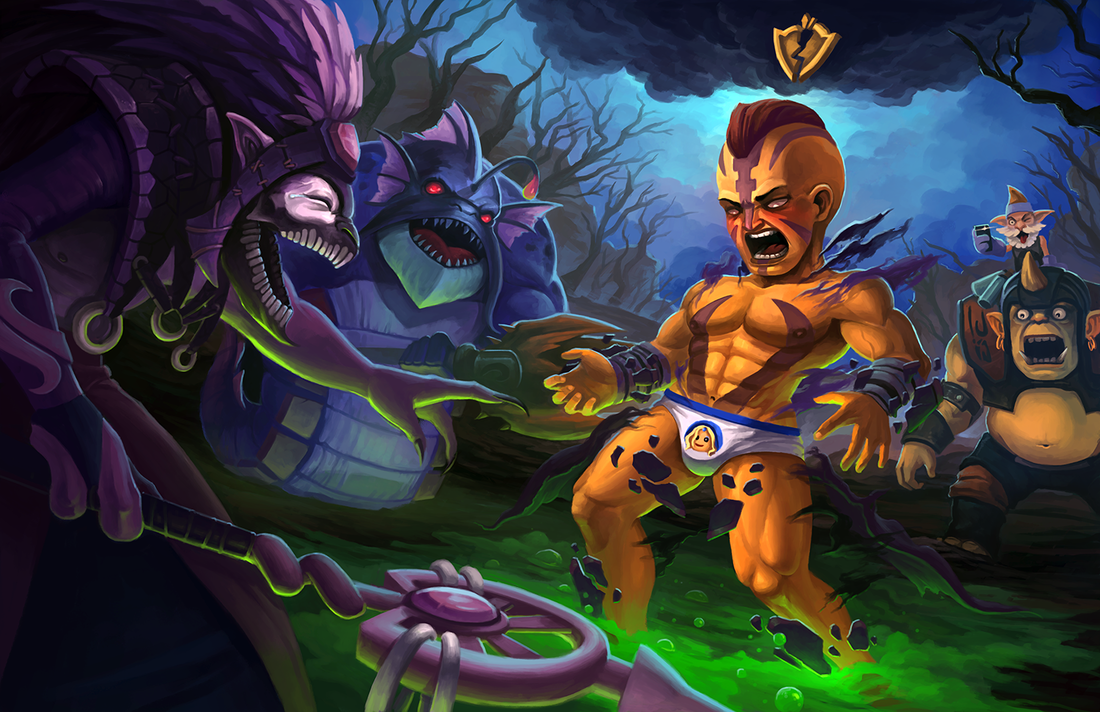
A perfectly executed negative armor strat reveals Anti-Mage's deep, dark secret.
No WIPs this time around... pretty much did the entire painting on one layer. |
Archives
April 2023
Categories
All
|


 RSS Feed