|
I received Pokemon Omega Ruby as my birthday gift from my girlfriend this year. Having played the original (I played Sapphire back then), I am pleasantly surprised by the little touches Game Freaks did to enhance the experience. For one, I thought the 3D implementation to the game is so much more impressive than X&Y. I've been meaning to create a fanart of that game since completing it, but I didn't know how to approach it. Should I do a painting of my team that beat the Elite 4? Or just my character and my starter Swampert? Eventually I decided that I'll focus on the ORAS original character Zinnia. 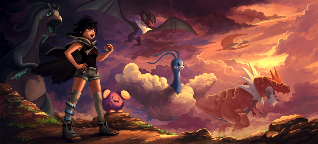 I won't spoil anyone who hasn't play the game, but let's just say that she's a Dragon type user ;) 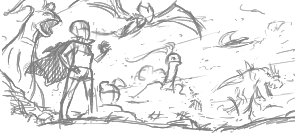 Let's talk about my process for this painting. For this artwork, I started with lines instead of the doing a tonal value sketch. I usually do lines when I know the designs of each character (usually the case for fan art). I personally feel that it is faster to nail down the drawing with lines than with value. 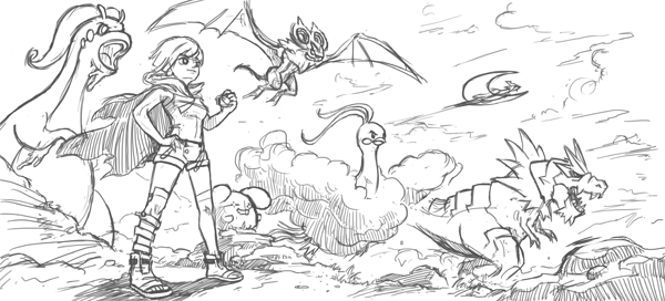 I do a more detailed pass of the line drawing on top of the rough sketch. With this, I tie down the general perspective of the drawing, making sure everything works before I move on to color. This step is helpful as it removes most of the question marks about composition and staging. 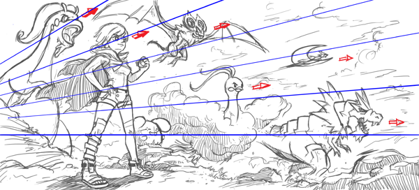 The composition here is simple: everyone is looking and/or moving towards the right side of the canvas. I made the drawing slightly more dynamic with the perspective. Here, the characters 'fan' outwards towards the right, creating the illusion of depth.  I start the coloring process with a simple gradient. What this does is it immediately sets the ambient lighting and the light direction of the painting. 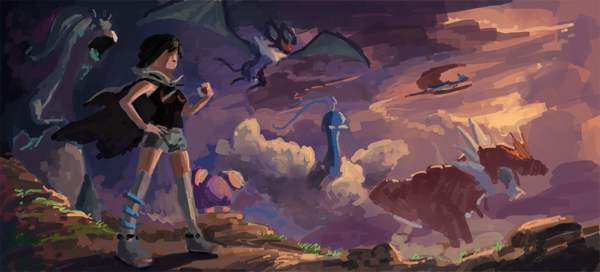 Now this looks like a huge jump from the previous step, but it really isn't. As mentioned in my previous post, I color pick from existing images to set the color scheme of my paintings. The trick to unifying the colors so that they look like they belong to the same scene is to not drop the hues on 100% opacity. I apply the colors on 70% so that the ambient lighting (the gradient from before) shows through. 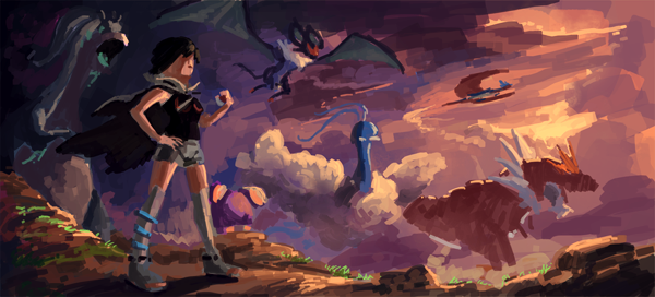 One con of color picking is that it usually produce very dull results. This is easily fixed with a Hue/Saturation and/or Color Balance adjustment. 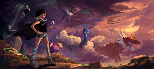 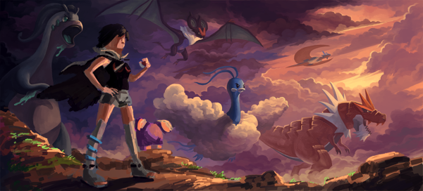  After laying the ground work, what's left is just the laborious process of detailing the characters and environment. 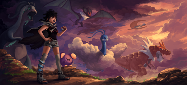 I felt Zinnia looked too passive here. She's a very lively and jumpy character and I want to show that. So I tried opening her mouth and she looked much better.  Some more color adjustments and the painting is done!
1 Comment
cheese18
2/10/2020 11:21:11 am
Wow. I just found your work from a deepdive on the web and I am shocked. Your work is incredible. You definitely deserve some more recognition. Keep up the great work! Leave a Reply. |
Archives
April 2023
Categories
All
|

 RSS Feed
© 2012 - 2023 JASON WANG