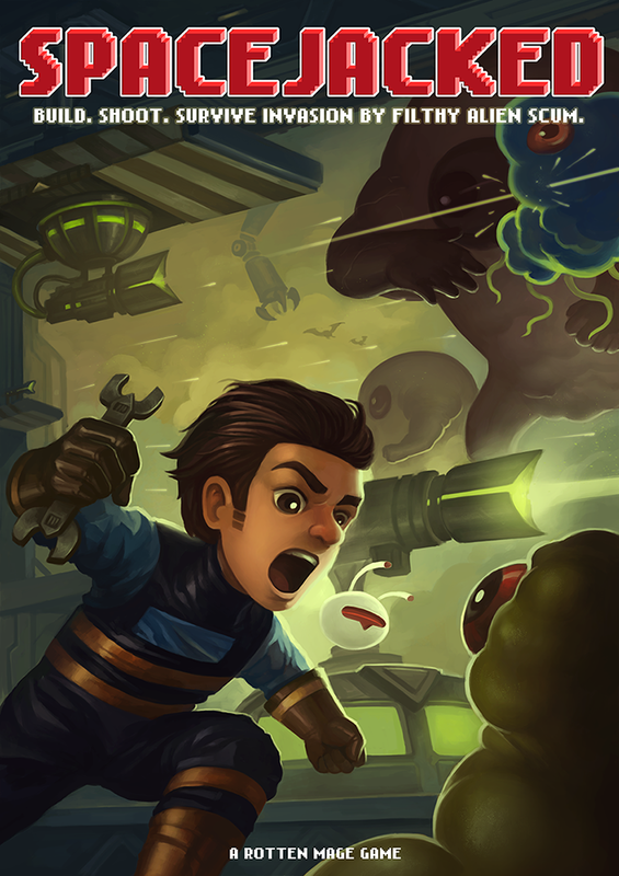
 I was commissioned by my friends at Rotten Mage to create their poster for Game Start 2015. If you're attending the event this weekend, be sure to check them out! They are located in the "Singapore Gamebox" section of the convention.
Their game is coming out on Q1 2016. Be sure to give them your support! http://www.spacejacked.com/
0 Comments
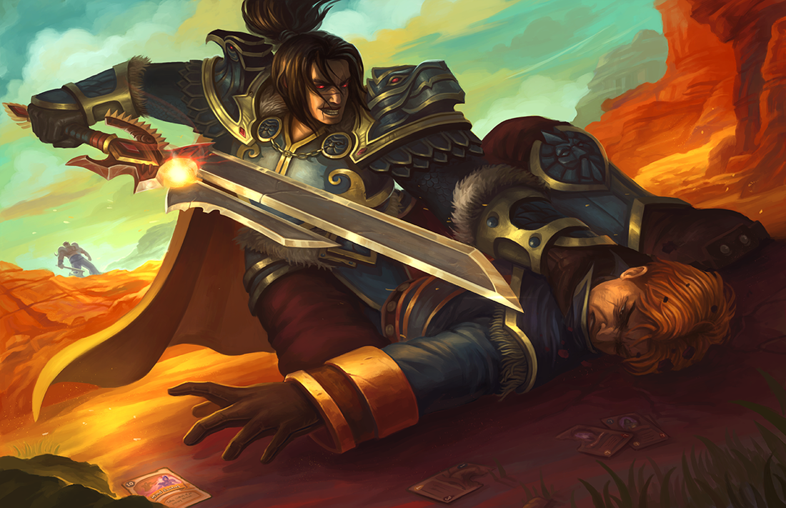 As the corrupted Varian goes for the finishing blow, Anduin reaches out desperately for his last card in his deck. The one card that can keep him alive and awaken his father from his madness. A little lore tid-bit for those who don't play Warcraft/Hearthstone: In the WoW universe, King Varian Wrynn is the leader of the Alliance and Prince Anduin Wrynn is his son. In Hearthstone, Varian is a Warrior-only card, which leaves him under the command of Garrosh Hellscream, former warchief of the Horde and overall bad-guy. I thought it'll be fun to see the duel between the father and the son. 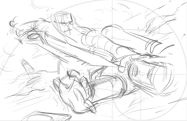 I started with a gestural drawing. As with the Ysera painting, I decided to loosely follow the golden ratio for the composition. Note how I tried to play up the dynamic perspective initially. 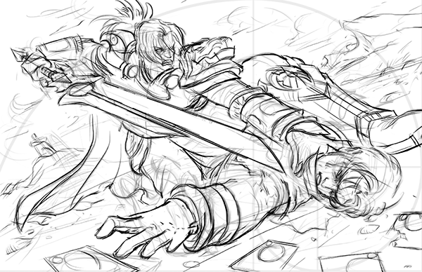 Added some details to the sketch. For this artwork, I decided to flesh out most of the details in the painting stage rather than in the lineart. This decision will prove to cost me quite a bit of revision time. 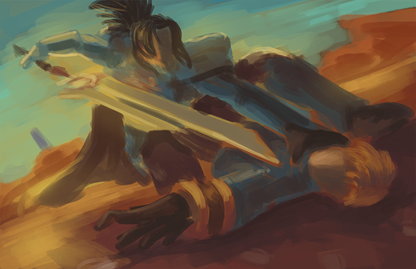 For the color scheme, I decided to go with something more sunset-sy to draw out the drama of the battle. I chose to have a desert/dry land as the battlefield to match the yellow board of Hearthstone. 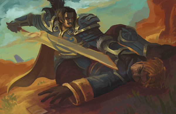 In the past, I used to immediately start detailing isolated areas of the painting after the initial color scheme phase. I found that doing a medium detail pass is actually very beneficial for the painting. It sets the lighting and being able to quickly define the characters' facial features boosts my confidence to push forward. 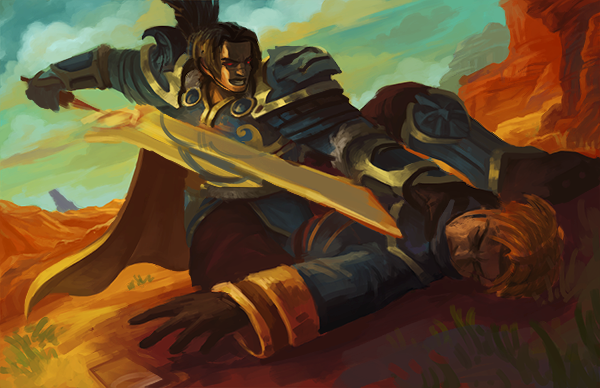 My new laptop has a very saturated color display. When I compared my image on my secondary monitor, I noticed how dull my initial color scheme was. I quickly fix it before proceeding on. 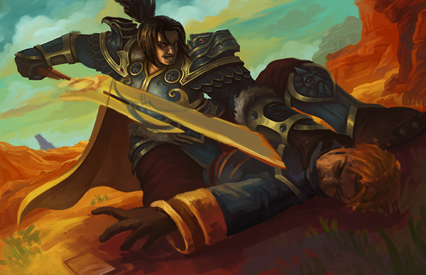 With all the preliminary work done, I started working on the details. 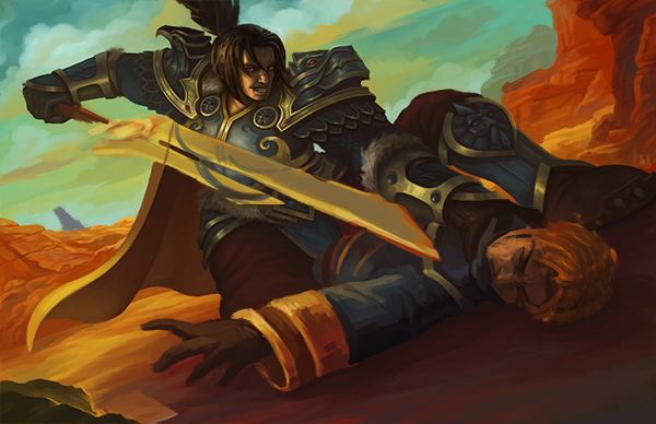 Fixing the ground and background elements. 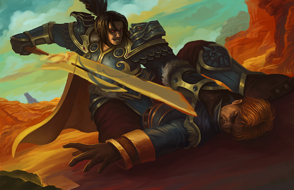 Detailing Anduin. 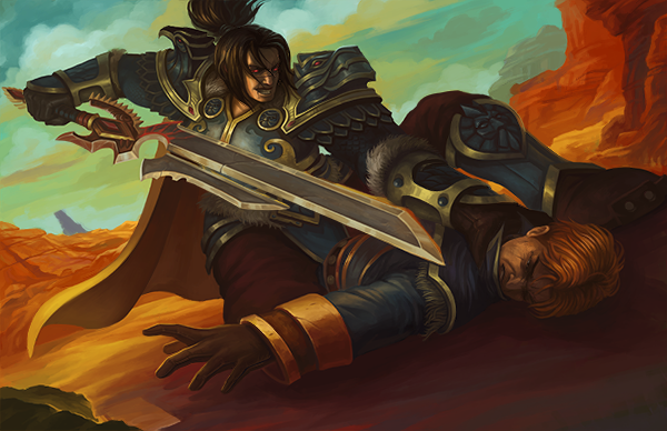 Fur and hair details and Varian's sword. 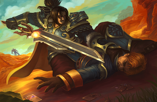 At this point, I was pretty satisfied with the painting. I posted on the LevelUp! group and my friend's comment was that the foreshortening on Varian looked wonky. His legs looked too big and disproportionate to his other body parts. 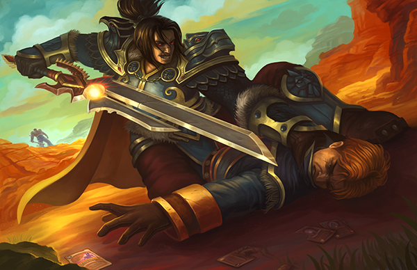 I merged all layers and moved stuff around. I think the legs looks more acceptable now and was ready to post the final image online. But after one night's rest, his left arm looked too long for me.  This is the final iteration.. I think.
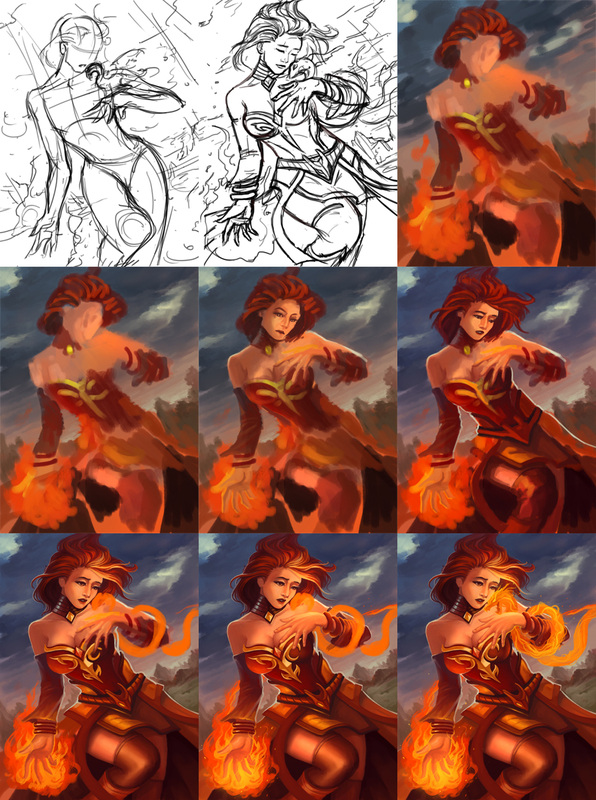
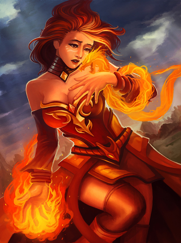
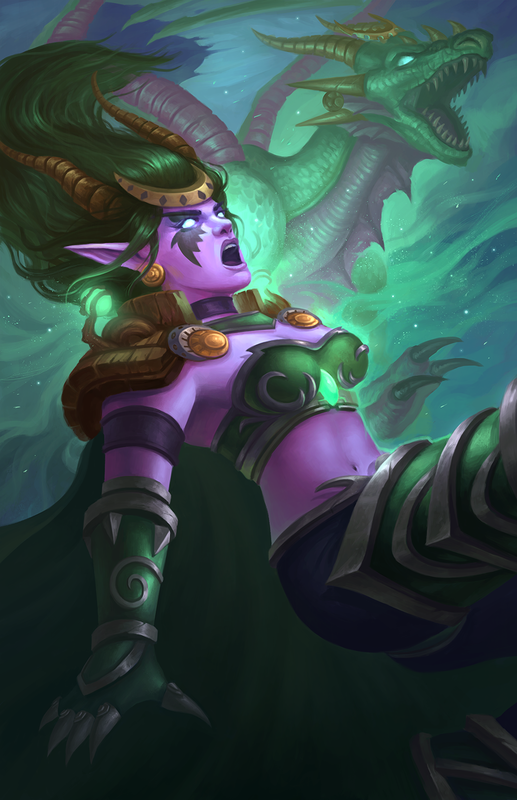 Ysera is the Aspect of Green Dragons, and is the gatekeeper of the Emerald Dream. Ysera is green, and her skin glitters with countless emeralds for scales. Her physical form is ghostly, ethereal, like watching a living dream or vision. The Emerald Dream is a place where all living beings dream when sleeping. It is a place of where sentient beings have dreams of hope, and faith for a better tomorrow. From the Emerald Dream, Ysera can observe all lesser races. Her eyes are always closed, although you can see her pupils move constantly below her eyelids as if watching many dreams at once. Lore from Hearthstone Wiki I started playing Hearthstone again after the latest expansion "The Grand Tournament" was released. This is actually one of the key reason for my disappearance that I did not mention yesterday. Since I'm a free-to-play miser, there are some cards that I wished I had. One of them is Ysera; the card design is just so cool! I decided to do a fanart of her to restart my personal art routine. Process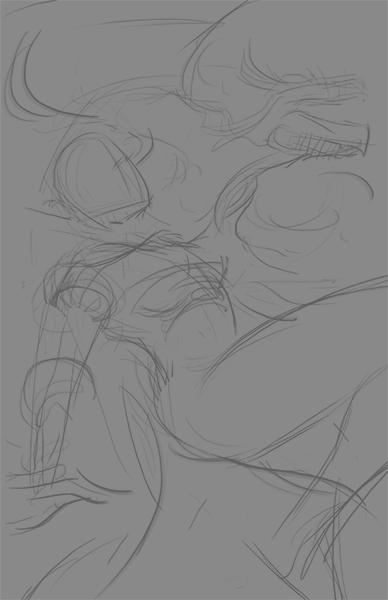 I started with a quick gestural sketch of how I wanted the image to be composted. For this particular painting, I tried to follow the golden ratio. 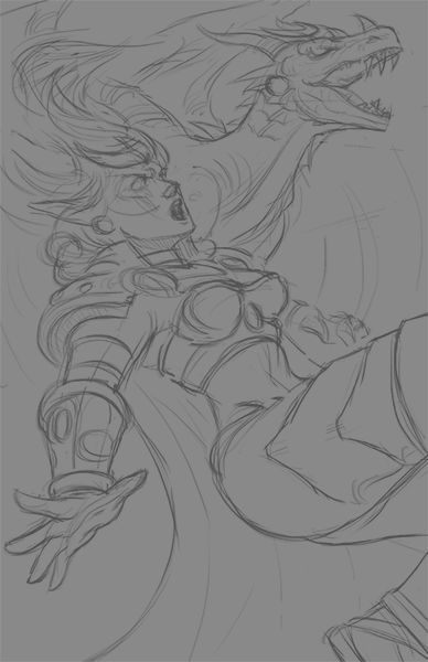 After I get a composition I'm fairly satisfied with, I sketch in more details of the characters. This is also the time when I started to gather more references (i.e play some Hearthstone). 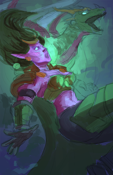 After a massive losing streak in Hearthstone, I decided to go back to work on the painting. I start by filling in the general color scheme. Being a painting of the emerald dragon, the colors chosen here are pretty straight forward. 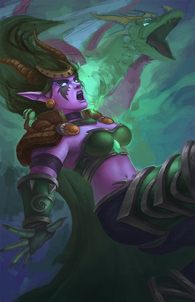 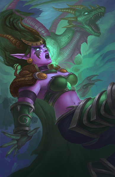 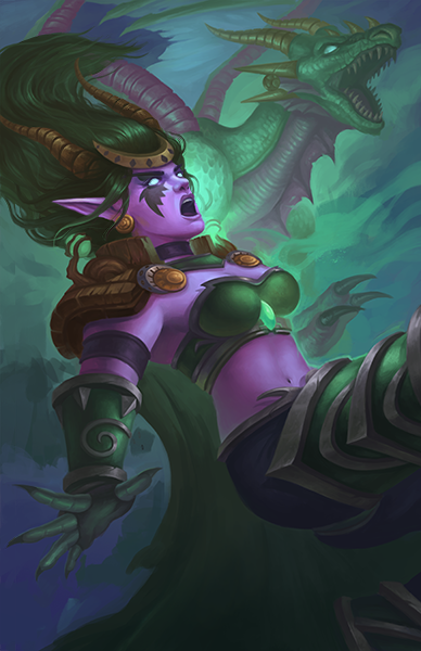 After the preliminary work, it is a case of grinding out the rest of the details. Much like grinding the ladder in Hearthstone, the process can be fun and painful at the same time. I, for one, like the monotony of painting details. The two major compositional changes here are that I opened the dragon form's mouth a little more to make it more fearsome, and I shifted the whole painting to the right because the tangent of her fingers to the left edge of the page was bugging me. 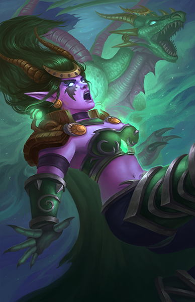 At this point in time, I thought I was done with the painting. The only problem I could see was the weird shape the cloak is making. The idea here was that the cloak shouldn't be behind her hand as I wanted to preserve the silhouette. I posted the above image in the Level Up! group and got some comments. One issue that I missed was how the right hand wasn't working. I imagined a more fore-shortened arm, but members of the group did not share my views. I tried iterating the painting based on their comments.  And here's the final form of the painting! I think that making the arm longer and less fore-shortened was a good call. I also like that the hand is no longer a clear silhouette now that it is placed in front of the cloak. This draws more attention to her face and the dragon form behind, which is the focal point of the painting. 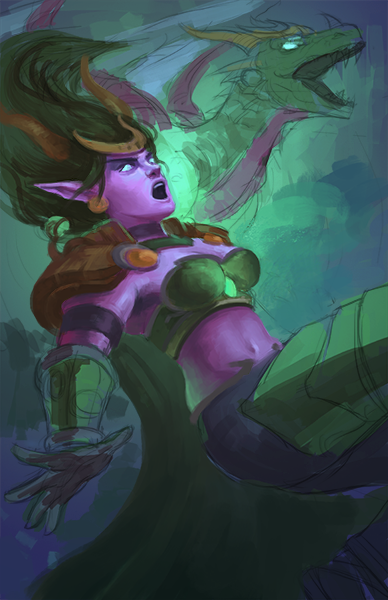 Next I added more details on her face. Normally, I will work my paintings from the background to the foreground. But since this is a character-centric piece, I know that it is important to nail down her face as soon as possible. Getting the face right gives me confidence to carry on the rest of the painting.
 When the DeviantART Heroes of the Storm fanart contest was first announced, I knew I HAD to participate. Although I haven't tried the game, I am a huge fan of the Warcraft and Diablo universes. In the midst of conceptualizing and executing this painting, I was hit with a major personal tragedy. It gave me some time in between to really think about the painting. 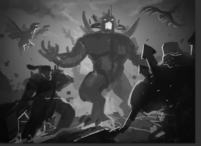 As usual, I started with a grayscale thumbnail sketch. Initially I wanted to create a series of thumbnails, but I kinda like this one and I decided to stick with it. 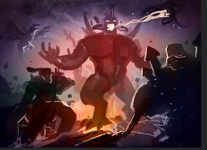 Next, I blocked in the colors using Color/Multiply/Overlay blending modes. You'll notice that I added the laser for Diablo. I wanted more interaction between the characters and this was something that players of the game can relate to. I wish to create fan art that players of the game can understand and relate to. 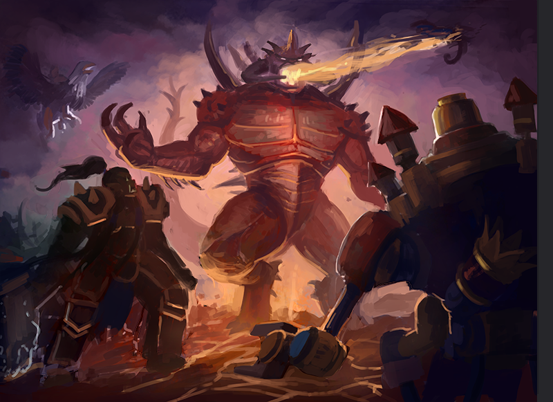 I started adding in some details to the painting and started to see some major problems with it. 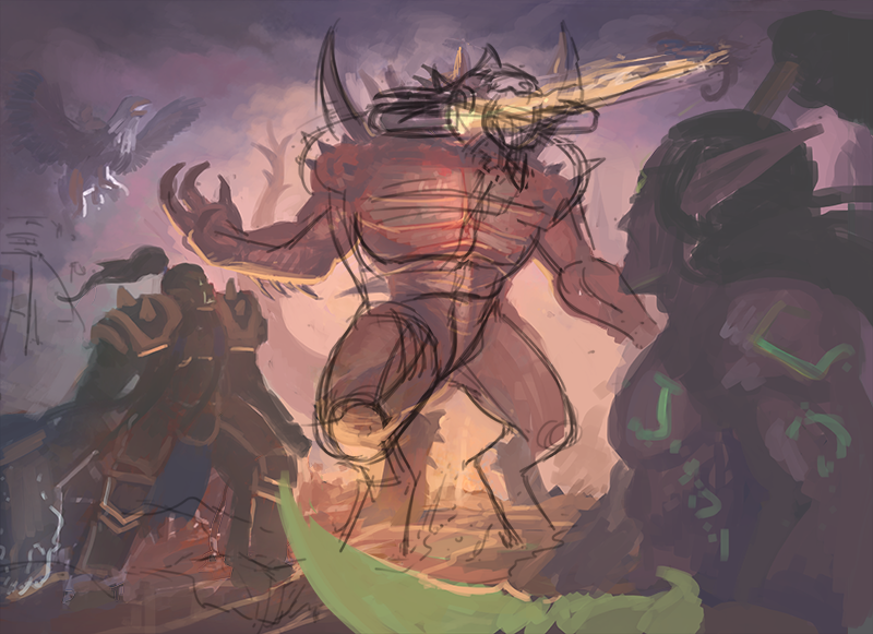 Like the sci fi painting I did before, I screened a white layer and sketched over the painting to tweak the pose of Diablo. The old pose was too static and lacked the force of the action he is making. You'll naturally tilt your head forward when you shoot laser out of your mouth. Trust me, I know. 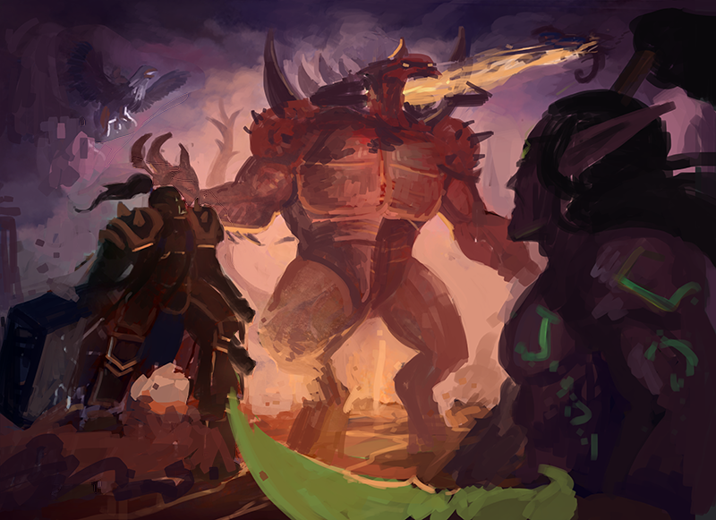 Did a quick block in of colors to test the pose out. Oh! I also replaced Gazlowe for Illidan. Illidan has always been one of my favourite characters in the Warcraft universe (I'll say it's between him and Arthas) and that also introduces some greens to the painting too. 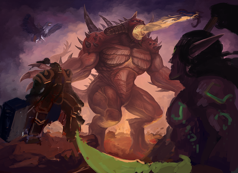 Detailing Diablo... 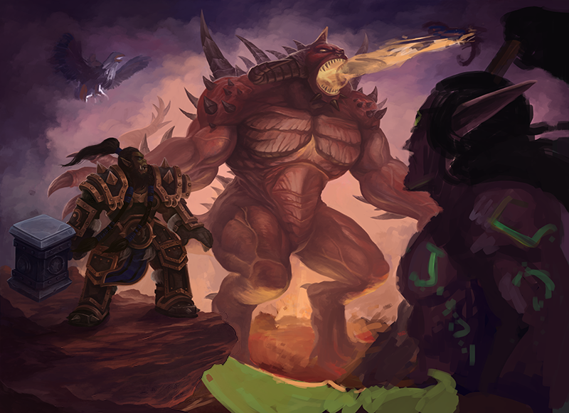 Next was Thrall. You'll notice that he looks shorter as compared to the sketch from before. I tried to mimic the official proportions, which resulted in a shorter character. 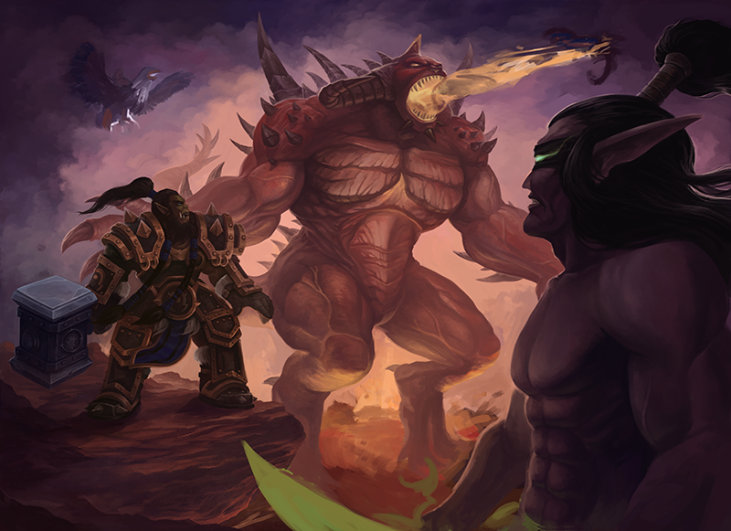 Next, I moved on to detail Illidan. One of the problems Illidan posted was that his weapon will block off Diablo and Thrall. I had to come out with some solution to still show all three elements (because Illidan's dual blades are so darn iconic) and still keep the composition clean. 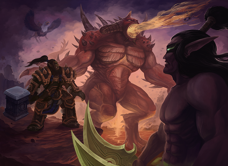 In the end, I made the blades smaller. I'm not proud of this solution, but its the best I can come up with. 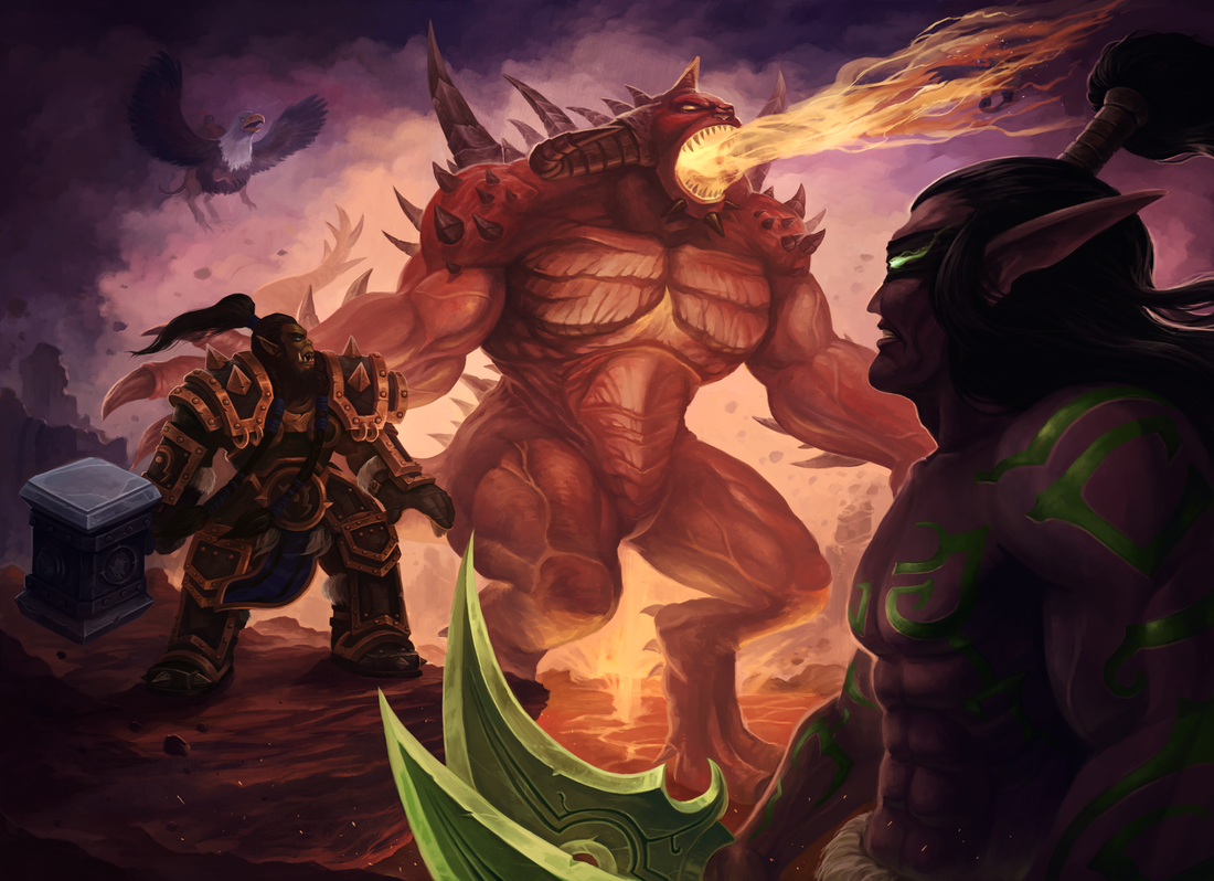 Final.
 It's been about 2 weeks since I posted anything. Crunch at work has kept me preoccupied and away from personal work. Uninspired to create anything new, I looked through the folder of thumbnails I made when I was preparing artwork for the Bali workshop and selected one that interest me. 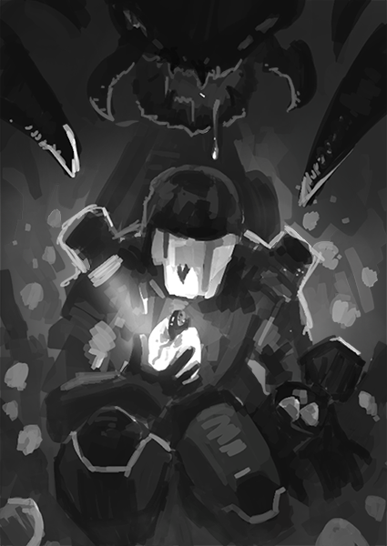 I went with this one as it has been awhile since I made something of a more realistic style. The sci-fi genre is also something I rarely approach, so I thought it will be a good learning exercise. The first thing I noticed while looking at the thumbnail again after 6 months is how awfully boring and cliche the image was. I also didn't like the suit design of the main character, which was a blatant Master Chief rip-off, sketched quickly at that time to bring the idea of a space marine across. 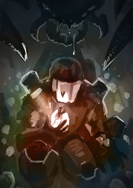 However, I decided that I can fix the suit later and proceeded to block in the colors first. 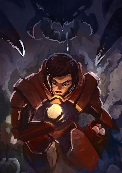 I removed the helmet on the marine. I also made the decision to cast a female for the role of the main character. At this point of the painting, I felt that things just ain't working. The new suit looked identical to Baymax from Big Hero 6, the female character's face didn't look appealing. The color scheme was also wonky; it didn't feel like a sci-fi painting. I was feeling quite depressed about the direction this painting was heading and almost stopped working on it entirely. 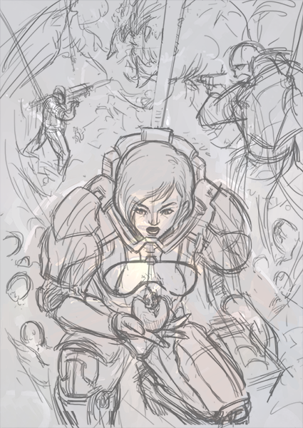 But I decided to reset and give it another shot. I've recently started watching Attack on Titan (yes, I am very up to date with the latest anime) and have become hooked onto the series. For the re-envisioned illustration, I decided to tweak the story. It is still about a marine finding an alien baby and unaware of the alien mother creeping behind. The new story introduced her other squad members, who are clearly aware of the sneak attack and fending the angry mother off the main character. I added in the repel line on the squad members to add to the drama as they are stuck in this hole with the angry alien quickly approaching towards them. 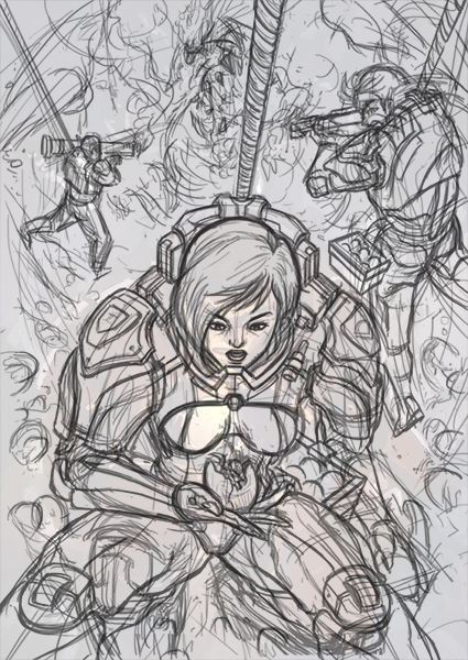 I did another pass of the line work, adding more detail to it. 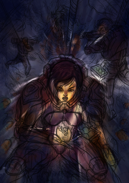 I didn't want to waste the effort from before. While I didn't like my initial color choices, I felt that the values were not too bad. So I applied Hue/Saturation and Color Balance adjustment layers and a motion blur filter to the original layers to fit them into this new composition. 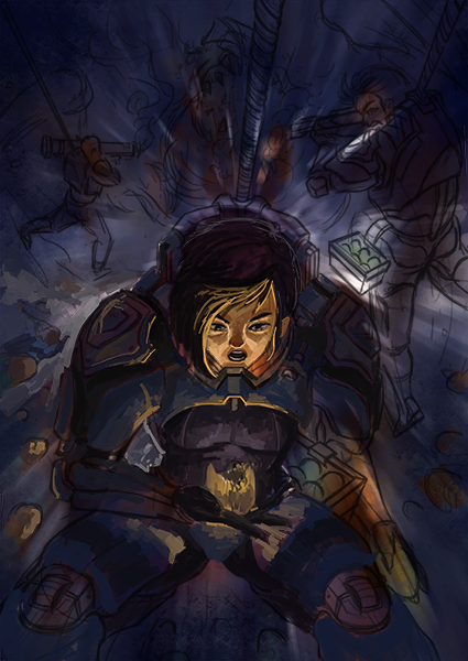 I know the success of this piece hinges on the rendering of the main character, so I started with her first. Also notice that this for this painting, I collapsed the line art into the color layers. I don't usually do this, but I thought I managed to capture the emotions quite nicely with the line art this time around, and didn't want it to go to waste. 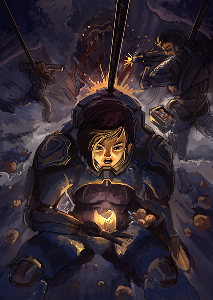 I blocked in the basic colors for the background and finally the foundations of the painting was set. From here on, I felt less stressed about the final outcome of the painting. I can just relax and mindlessly render the details. 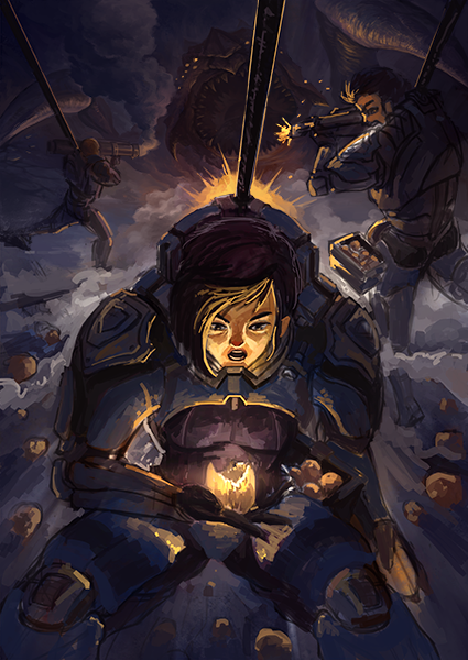 I started with the alien in the background. 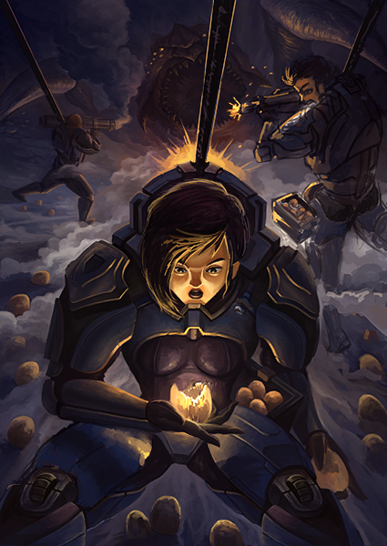 Then the main character. 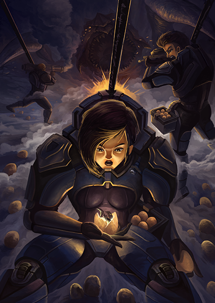 And then the character on the right. 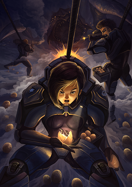 I reworked the face slightly as it was looking really weird before. 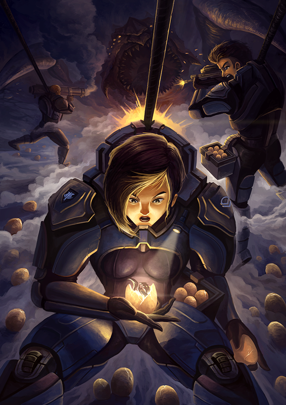 Some color adjustments and effects and the painting is done. To be honest, I'm not exactly sure if I'm happy with the results. I felt that the story was still quite ambiguous and unclear here. I'm also not 100% satisfied with the rendering of the main character's face. Alas, I decided to call it a day and stopped working on it. I'm glad that I learn a few things by working on this painting though.
No posts next week as I will be on holiday back in Singapore. 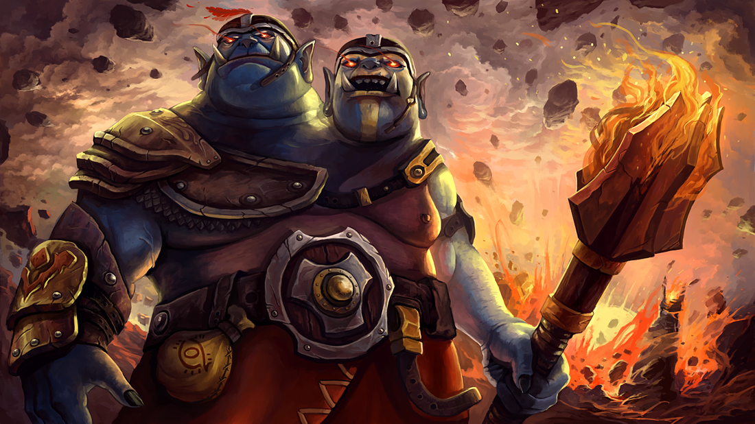
Loading screen done for the recently published Ogre Magi set.
With this set equipped, you can easily carry the entire team with Ogre! Workshop Link As part of the requirements of the Bali workshop, each student has to submit a 3-artwork portfolio and complete an assignment. While browsing my recent paintings, I realized that I've been doing too little original work. Reluctant to overload my portfolio with fanart, I decided to get to work on my original ideas. I did a few quick compositional thumbnails and ran through some friends. One of the thumbnails that was a favourite amongst them was selected and brought to completion: 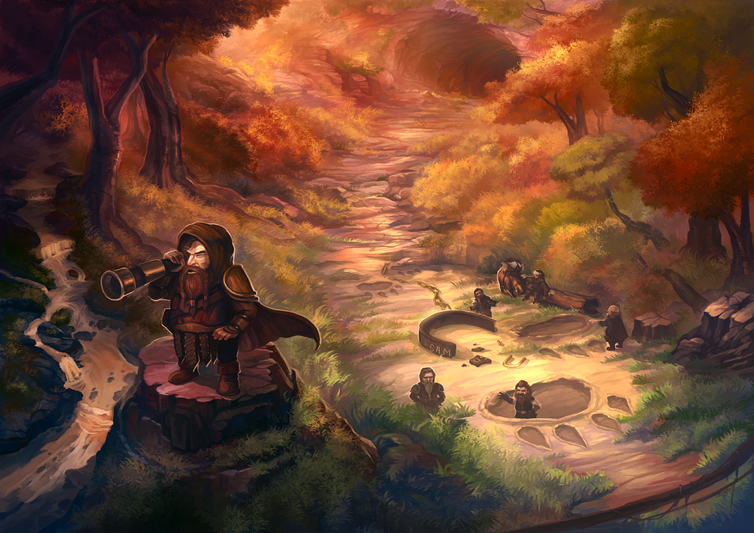
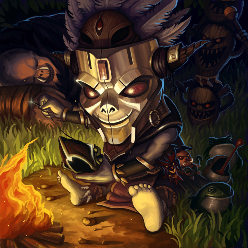
Entitled "Who Let the Dog Out?", I wanted this piece to be a display of my current style. I've been painting a lot of vibrant, over-saturated forests on Mekazoo and decided to bring some aspects of that aesthetics into this painting. I've also come to appreciate the more cartoony side of my work, and thus, wanted to keep this painting more quirky and fun. 
This is the initial thumbnail I created. Notice the almost top-down perspective and the dinosaur foot shaped footprint. 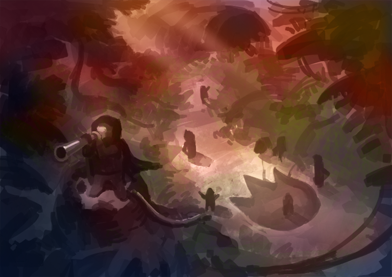
A basic color scheme thrown onto the grayscale thumbnail using Multiply, Overlay and Color layer blending modes. Alot of people ask me where I get my colors from. I simply color pick from existing images on the web. It's a much faster process for me. For this image, I wanted an evening sunset color scheme. 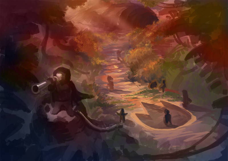
Begun some detailing work. I didn't like the top-down perspective of the thumbnail and decided to move the camera downward slightly. 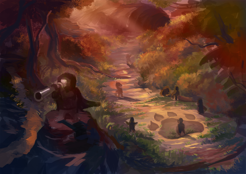
I was painting this while on a Hangout session with my friends. One of them pointed out that a dog footprint would be cuter than a dragon/dinosaur one. I agreed, and decided to change it. 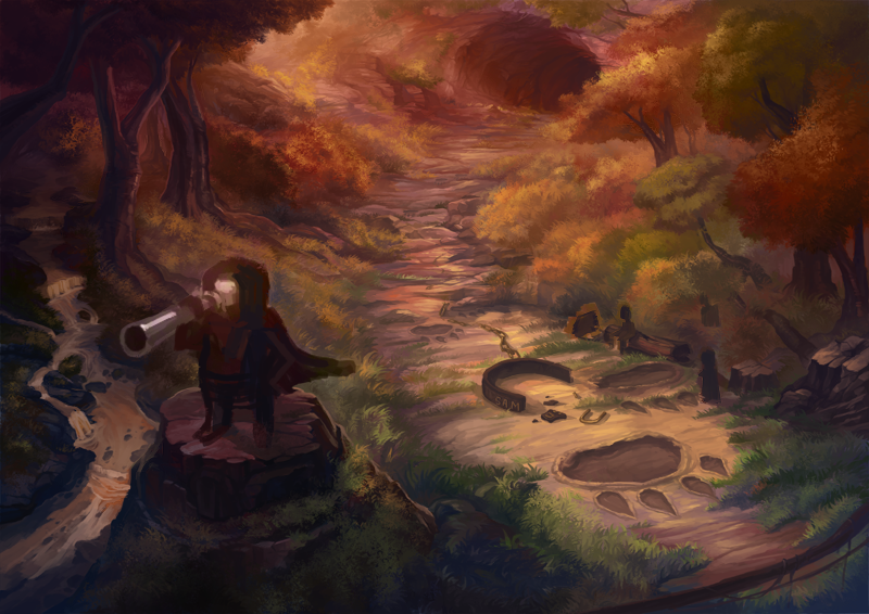
I thought it didn't make sense to have one singular footprint on the ground, so I added a proper trail, leading outward from the cave behind. I also added a broken chain to add to the story. I named the dog after one of my co-worker's pet. 
Detailing of the main character and his band of brothers. 
I posted the image on the Level Up! Facebook group for critique and comments and they gave some really helpful feedback. The main thing I changed was removing the left rim light on the main character as it was creating an outline around him that made him feel like he was not part of the painting. 
Final image with color corrections and light effects.
Last month, I took part in 2 deviantART contests, FFXIII - Lightning Returns and D3 - Reaper of Souls. While I did not win, it was an enjoyable experience doing these paintings. The Lightning turnaround in particular reminded me of the good ol' DigiPen PRJ251 days. 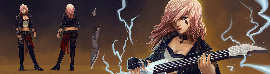
Completed this sketch a few days back while my internet was giving me some problems. It started off as a study of sorts, and ended up as a more detailed painting. 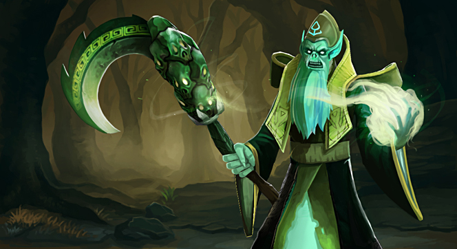
A Necrophos weapon I created together with my friend, Steven Hernandez. You can check it out on the workshop page here: http://steamcommunity.com/sharedfiles/filedetails/?id=238445804&searchtext=
Upvote it if you like it! |
Archives
April 2023
Categories
All
|

 RSS Feed
© 2012 - 2023 JASON WANG