
User Interface / User Experience / Graphic Design Portfolio
Selected UI/UX and graphic design works that I have done in the past. Usually I like to let the visuals speak for themselves. In this case however, I will include more text descriptions to explain the context of the brief and why I made those design choices.
Mekazoo
Working in a small indie studio usually means that one has to wear multiple hats. As no one in the company had any experience designing UI, I volunteered to take on that role. Here are some of the mock-up UI designs that I have done for the game.
At that time (~2015) I was not aware of the existence of wireframing tools like Figma or Sketch. So I used the traditional flowchart method to draft out the sequence the player will go through when navigating the menus.
At that time (~2015) I was not aware of the existence of wireframing tools like Figma or Sketch. So I used the traditional flowchart method to draft out the sequence the player will go through when navigating the menus.
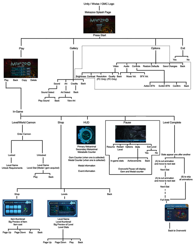
For the UI designs, I tried to keep everything simple and straight-forward while staying true to the stylised sci-fi theme of the game. Since the primary input device is a game controller, I made sure that all the selections could be made with a single axis of the directional stick (either an up/down or a left/right movement).
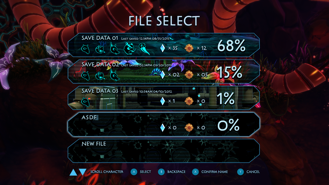
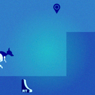
File loading screen design #1 - Vertical navigation and more information at one glance
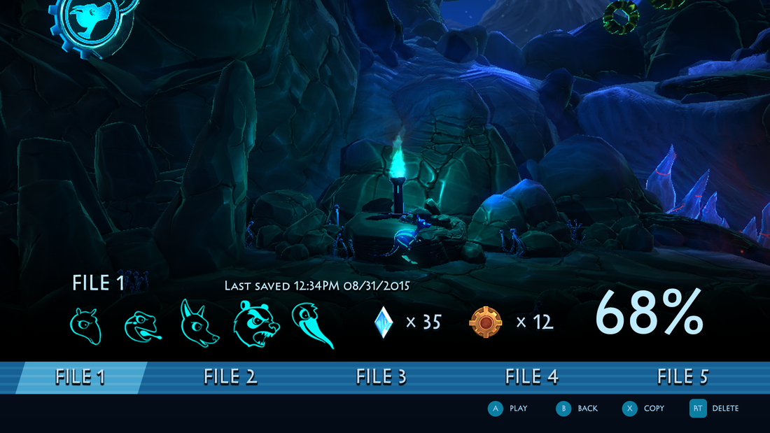
File loading screen variant #2 - Horizontal navigation with more emphasis on status of current progress
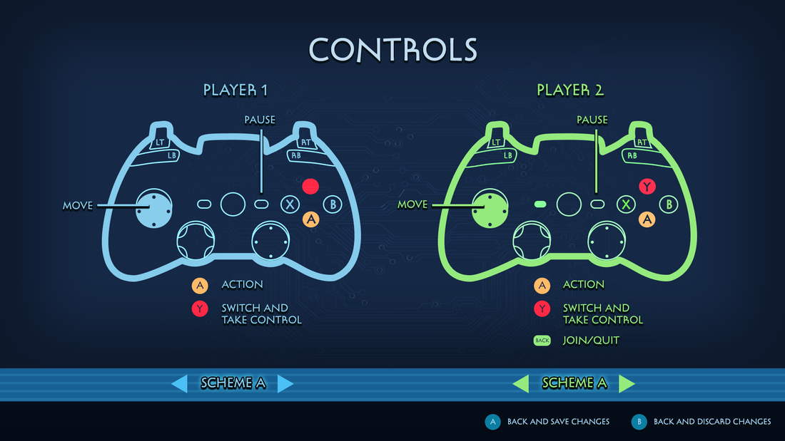
Controls screen that allows both players to make their changes simultaneously

Shop screen is the only screen with a tabbed layout due to the amount of information
When developing Mekazoo, we were mindful about keeping the amount of text inside the game to a minimum. As players, we disliked the feeling of being bogged down by tutorials after tutorials. It breaks the immersion of the gameplay experience and is something we would like to avoid in our product. This design philosophy can be seen even during the initial conceptualisation phase. Everything I draw for the game has to feel intuitive for the player, even without further explanations. Here are some of the user-centred designs I have conceptualised for the project:
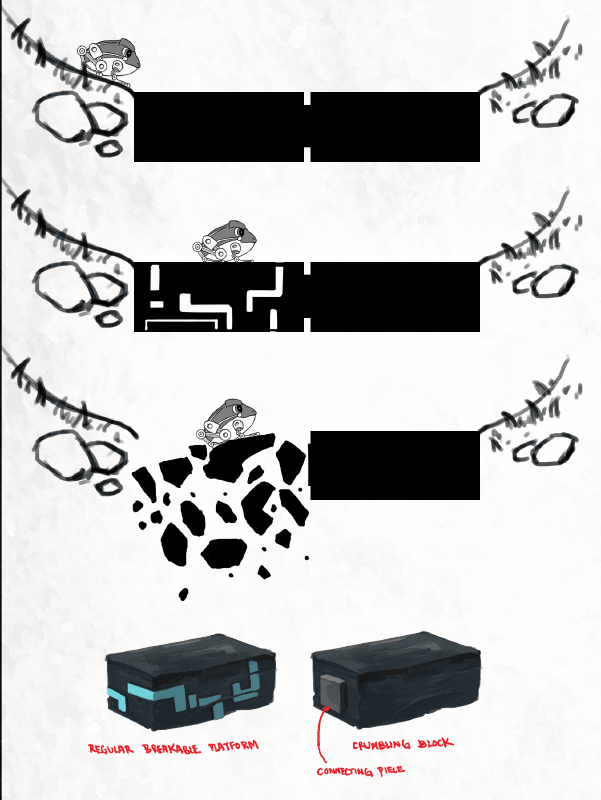
Breakable platform
|

Timed switch
|
The initial idea was to display the tutorial on a projector screen within the game. This diegetic approach aims to retain player immersion. The tutorial is also illustrated in a very graphical way where no explanation text is required.
Armadillo tutorial
Frog tutorial
Wallaby tutorial
|
Switching tutorial
|
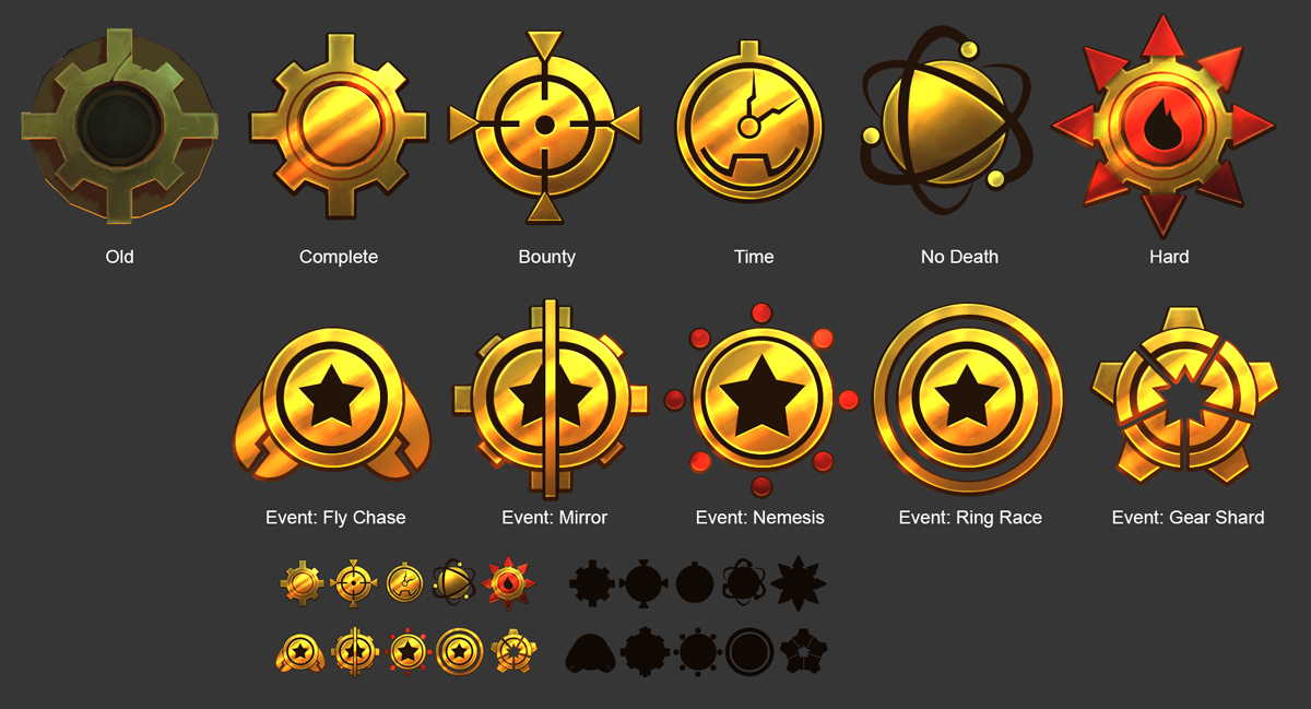
In-Game achievement icons
Sam
Sam is a mobile application that aims to promote the habit of helping others through monetary donations. We wanted to streamline the process of donations and make everything as transparent as possible. This includes detailed information about the charity organization, the individual or family that the donor is helping, and what the money is used for.
We also wanted to incorporate gamification elements to entice users to come back to the application periodically. However, we were mindful to exercise restraint as we wanted the donations to still come from their heart rather than in-app rewards.
We also wanted to incorporate gamification elements to entice users to come back to the application periodically. However, we were mindful to exercise restraint as we wanted the donations to still come from their heart rather than in-app rewards.

Home page
|
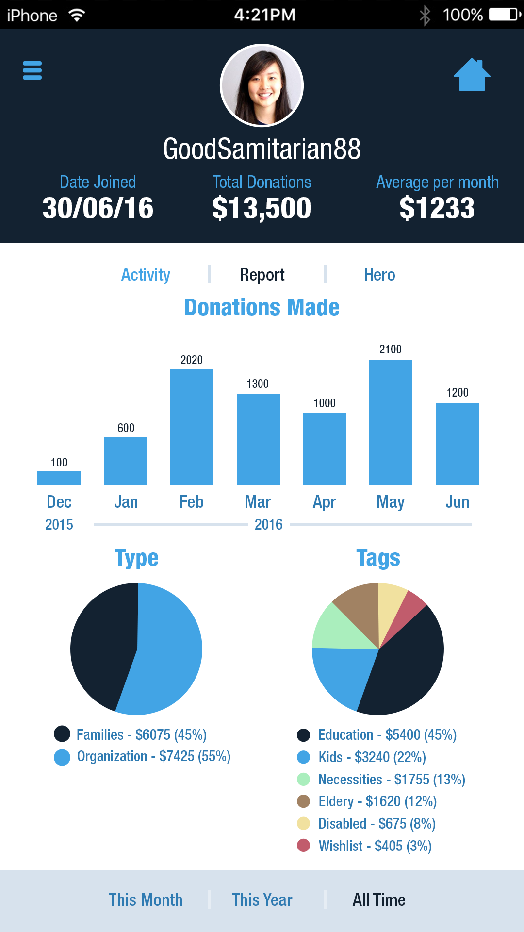
Profile page (stats)
|
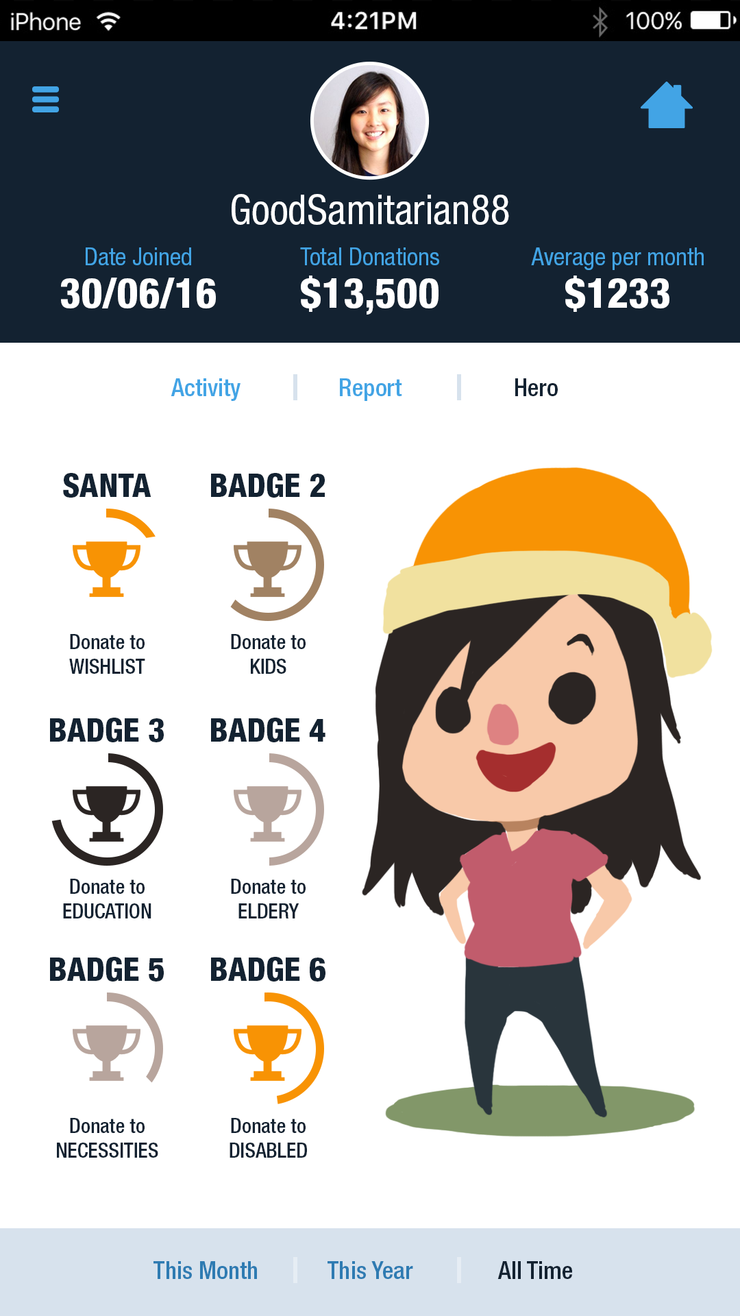
Profile page (achievements)
|
I went with 3 different ideas for the logo design. The first design emphasized on the heart shape created by the negative space between the "s" and the "a". I also used a whimsical font in an attempt to make the app look a little more light-hearted.
The second design was built around the idea of a superhero. We wanted to paint a narrative where heroes can exist in our daily lives and a simple act of donation, no matter the amount, can mean a lot to another person.
The third design is a more conservative one and features a familiar hand holding iconography with a more serious font. When working for a client, I prefer to offer at least one conservative design for them to fall back on should they feel that the rest of them are too avant-garde.
|
Initial logo ideation
|
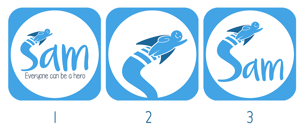
Variants for final app logo
|
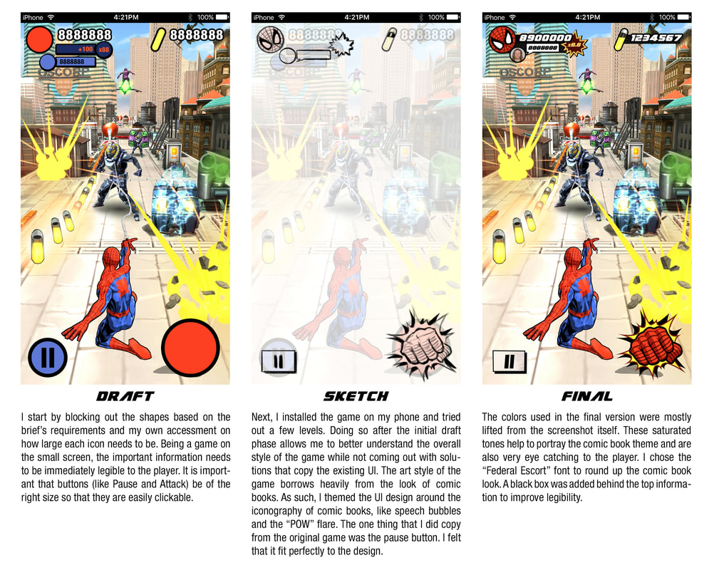
Spiderman UI
This was done as part of an art test for an art director position in Gameloft Hanoi. I was provided with the screenshot of the game without the UI elements. I was also briefed on the critical information that needs to be displayed on the HUD.
Student Data Analysis
When I first joined my current teaching job, I was surprised that there wasn't any data analytics done on our students' performance and their education advancement. I felt that the information is necessary to provide better support and advice for our students.
Last February, I took an internal short course on Tableau. It was my first experience with a data analysis/data visualisation software. With the knowledge acquired, I was able to present some interesting findings with regards to the student data that we have. Due to the sensitive nature, I have censored out some of the information.
Last February, I took an internal short course on Tableau. It was my first experience with a data analysis/data visualisation software. With the knowledge acquired, I was able to present some interesting findings with regards to the student data that we have. Due to the sensitive nature, I have censored out some of the information.
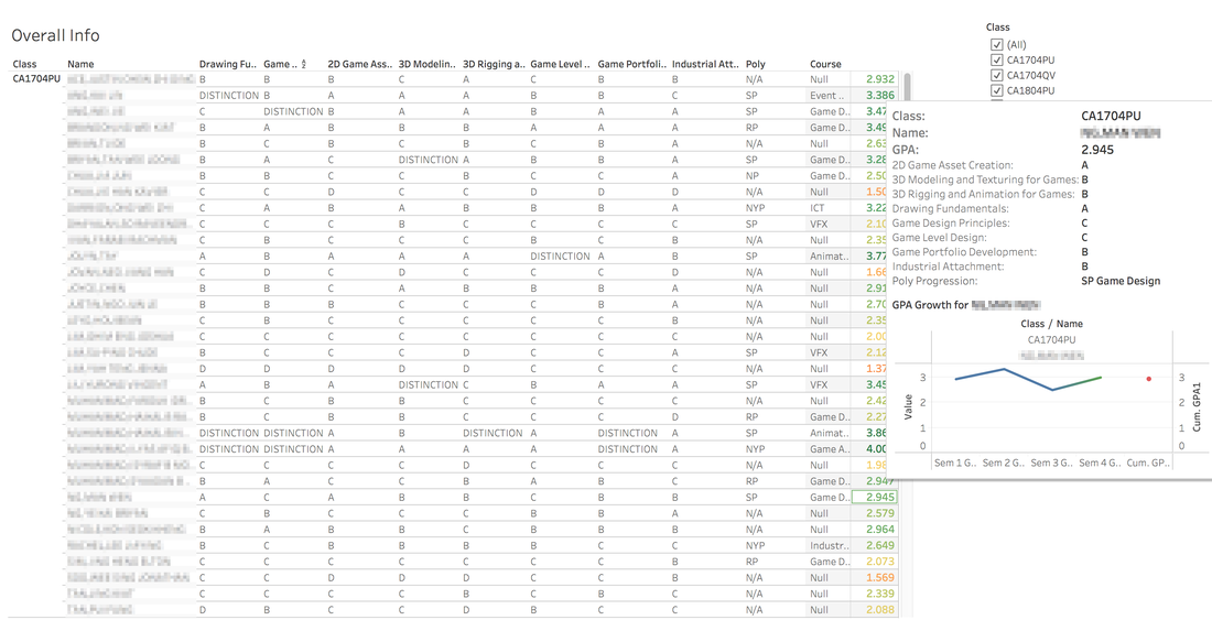
Students' overall performance tracking
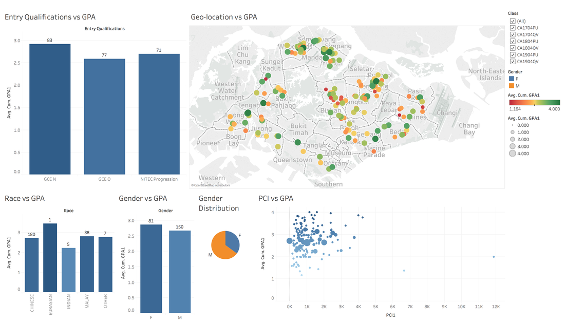
Grades correlation between other factors like race, gender, affluence, location, etc
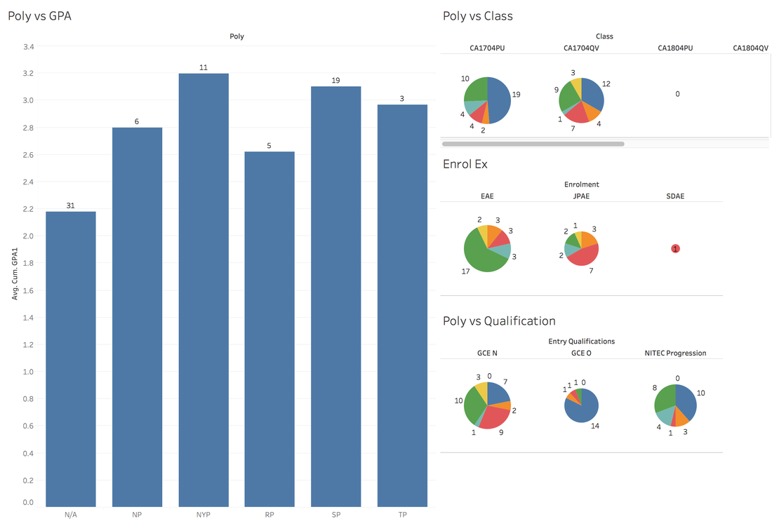
Placement rate in the next stage of their education
Logo Design
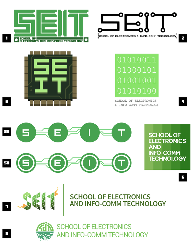
Initial logo exploration done for my department (School of Electronics and Info-comm Technology). We were assigned the colour of Green and it is the main hue for the logo variants. Just like the logo experimentation for the "Sam" app, I like to provide a wide range of ideas during the initial stages before narrowing down and iterating on the selected design as the direction becomes clearer.
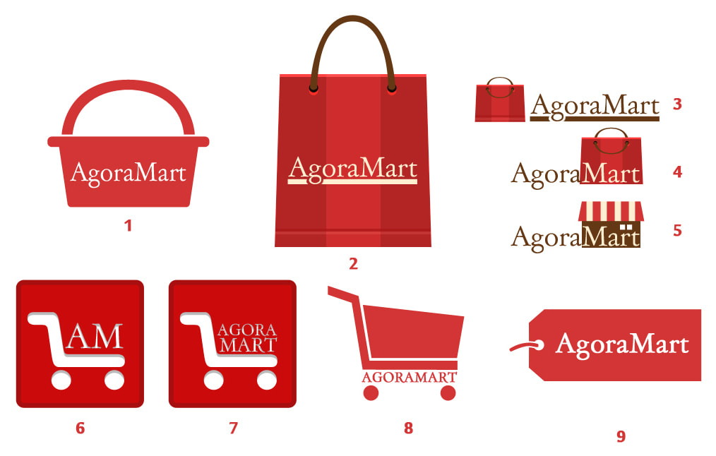
Initial logo exploration done for a local e-commerce entity. The client specifically wanted the logo to predominantly be in red and to use a Serif typeface for the text.
Teaching methods
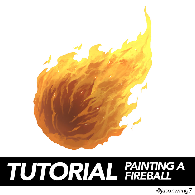
Teaching the current generation of teens is no easy task as you are constantly fighting a losing war for their attention. But instead of seeing social media as an enemy, I tried to use it to my advantage instead. I allow students to follow my personal account and will occasionally post tutorials like the one below.
I also post my demos online on my YouTube page for slower learners to take in the information at their preferred pace.
(Psss if you enjoy the content, hit that "like" button and subscribe!)
I also post my demos online on my YouTube page for slower learners to take in the information at their preferred pace.
(Psss if you enjoy the content, hit that "like" button and subscribe!)
|
|
|